Fast-casual restaurants are ubiquitous these days. They garner loyal followings from fans and tend to feature high-quality food and elevated designs. Let’s look at some standout fast-casual design stars.
 The best designs, says Lauren Chipman, WELL AP, CEO and principal, Chipman Design Architecture, Des Plaines, Ill., “communicate a clear and compelling narrative. Materials, lighting and environmental signage work in harmony to tell a story in a way that feels authentic and immersive.”
These brands differ from their QSR counterparts with subtle storytelling and brand colors, and design elements that are communal and localized with area-specific art and graphic details, according to Chipman.
Ultimately, Chipman says, “the best fast-casual interiors create a memorable experience that feels personal, efficient, and true to the brand’s voice.”
Let’s look at some standout fast-casual design stars.
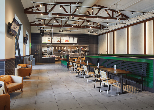
NOBLE CHICKEN
Cincinnati
 Chicken restaurants might be commonplace but Noble Chicken stands out with its design. This single-location spinoff from Wings & Rings will open its first franchised location in California next year.
Noble Chicken’s design is intended to be a little rebellious as evidenced by the logo of a chicken with a shaved head and a mohawk. Noble is a play on “no bull,” and that’s what the design’s intended to communicate — robust portions, Americana, punk rock, and anti-establishment.
“We’re confident in our chicken,” says Dan Sweatt, senior marketing manager. “We’re also confident in our portion sizes. We wanted a brand to match that confidence. We don’t mind that we’re loud and bright.”
Sweatt worked closely with Mike Ruehlman, principal, Goodfire Design, Indian Hill, Ohio, to create the design and they started by looking at their poultry competitors.
They found lots of red and lots of southern influence, so they avoided both. “We want to be more modern, more original, [and] more American than pigeonholed into the south,” Sweatt explains.
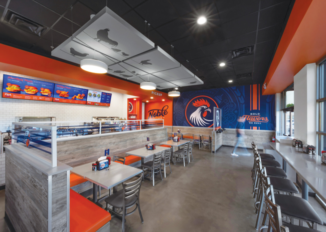 Noble chicken’s design is intended to reflect confidence and be rebellious.“Color was important; we’re very distinctive,” says Ruehlman. But so was the chicken head graphic, which he says helps audiences connect with the concept, because it’s almost personified.
There’s an element of fun to the interior design. Along with the chicken with attitude, there’s a sign showing a shield and B and S (for Birds and Sauce) that some people might read as BS, says Ruehlman.
Another sign, for the queue area, states “Pecking Order.”
The chicken motif carries into ceiling panels featuring more chickens. “We wanted a focal part on the ceiling and we wanted something fun, and this is where you’d expect to find birds,” Sweatt says.
“I look for those thought provocative points in a store,” says Ruehlman. “I like to surprise and delight wherever you can.”
A unique element of future Noble Chicken stores is a pickup door. So far, 70% of the business is off-premises, so on the side of the building is a “fly thru pickup.” Customers pull up to a sliding door where they receive their digital orders. The entire side of the building is branded with an awning and the brand colors.
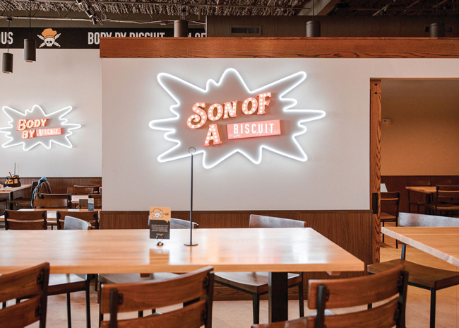
Vicious Biscuit
Mount Pleasant, S.C.
Another brand with some attitude is Vicious Biscuit, a brunch concept with 10 locations.
Vicious Biscuit also wanted to be different from its competitors, which are “light, bright and airy,” says COO Amanda Kahalehoe. “You step into Vicious Biscuit and you’re in a different place with a different mood and it all plays together with that energy.”
 While Vicious Biscuit’s design is intended to be edgy, it’s also meant to feel homey, too.
The goal with the design was to incorporate the edgy logo that looks like a skull and crossbones though the latter are rolling pins, along with a homey design with lots of natural-feeling wood and tilework “to elevate the experience and be modern,” says Kahalehoe.
 The brand colors reflect the colors in the food. The brand specifically looked at the colors in its huevos rancheros — red and green in the pico, off-white onions, black beans, brown biscuits — which keeps the colors natural, matching the natural, freshly-made food. “We want it to all feel tied together — the food, the experience and the design — they create this holistic Vicious experience.”
Much of the “wood” is not actually wood in order to keep costs down. The wainscotting in most locations is a laminate and all trimwork is a wood composite from the same company.
The brand also uses stained wood on elements such as wainscotting, trim and millwork, and to accent the menu boards, so they don’t look so digitized. “That also wears very well over time, says Kahalehoe, which reduces franchisees’ remodel costs down the line.
A big priority was keeping costs in check for franchisees and making new locations fast to open, so there are identical elements in each restaurant such as a black and white mural of the signature “fat boy,” biscuit, an LED starburst, and “Jam Bar” signs as well as the signature tag line Son of a Biscuit. Each unit also has a second mural, of something local.
Opening a new restaurant is turnkey. “There’s no thought beyond the localization, which makes the process quicker,” says Kahalehoe.
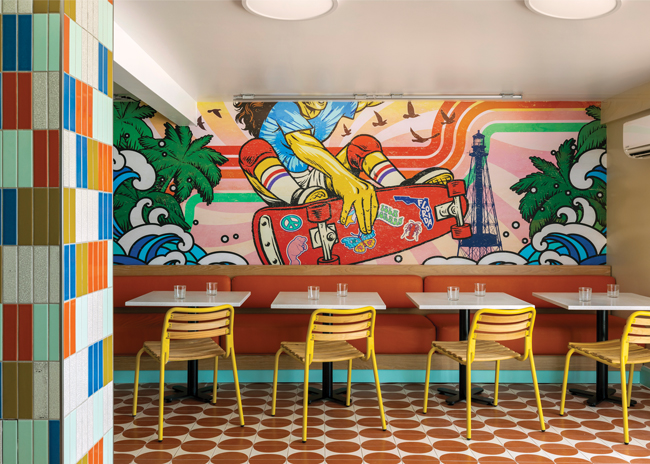
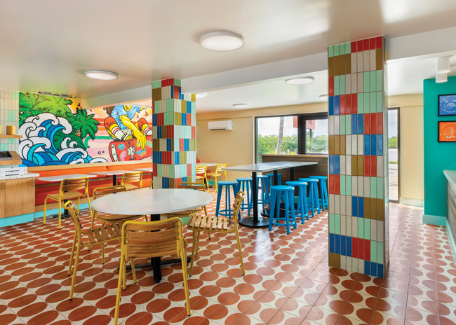
Islamorada Pizza Co.
Islamorada, Fla.
Islamorada Pizza Co. was designed to attract both locals and guests at Three Waters Resort & Marina, where it’s located.
“They wanted to embrace this beachy, casual boho vibe of the Keys and make it super family-friendly, approachable, and colorful,” says Kristin Cullen, design director, Saguez & Dash, New York City. “They wanted it to feel comfortable for people in flipflops.”
The color in Islamorada Pizza Co. captures a fun, energetic spirit to make guests feel comfortable.
The restaurant is full of natural light but also features primary colors in the chairs, stools and mural. Two columns are covered in what looks like randomly placed colorful tiles but which were in fact carefully placed and carefully chosen to pull colors from the mural to tie the restaurant together. “We used them to add some funky colors and patterns into the space,” says Cullen. And, she adds, “the imperfection of the columns plays into the casualness. It’s not supposed to be precious and is supposed to be ad hoc.”
The floor is covered with tiles with terracotta-colored circles. “They’re not perfect and reminded us of little pizzas, so we tried to repeat some of that even in the simple lights in the ceiling. These round elements emulate the shape of the pizza being artisanal," says Cullen.
 Images courtesy of Julie Soefer
The floor has a retro feel to it, as does the custom mural, Cullen points out. The mural features vibrant color, waves, palm trees and a skateboarder. “The skateboard is a throwback and there are retro lines running all the way in the background. We just wanted to be playfully reminiscent — have a bit of nostalgia but not too much.”
With all this color, Cullen adds, “it works for a fast-casual restaurant because you’re in and out; it would have been too visually stimulating for a long dinner. It captures a fun, energetic spirit for a short amount of time.”
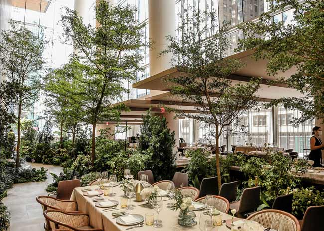
Shake Shack
Portland, Ore.
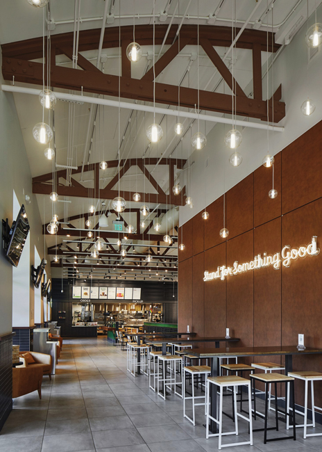 The Portland Shack Shack blends the interior and the exterior and fits in with the city’s architecture.The Shake Shack in downtown Portland, Ore., was designed to put as much emphasis on the exterior as the interior, in this outdoorsy city.
There’s a covered patio and uncovered seating, emphasizing the connection between indoors and outdoors.
The exterior design ties in elements from the surrounding buildings including black metal storefront windows and door frames, glazed brick and aluminum panels. The green quarry tile on patio planters is a repeated color in Portland architecture, seen in a bridge, concert hall and public benches.
A local redwood trellis also separates the seating, providing a warm texture that contrasts with the black-painted steel columns that support the wood blocks. “The combination of warm hardwood and sleek black steel brings both function and a refined, modern feel to facade,” says Liliana Borchers, senior architectural director, Aria Group, Oak Park, Ill.
Because this restaurant is downtown, Shake Shack wanted to activate the space outside to draw people in. The lounge seating inside, which is unusual for Shake Shack, was included to increase the feeling of a community space.
Inside, soaring curved ceilings feature painted wooden trusses that connect to the vertical elements of the wall, establishing a sense of continuity. This space is very long and it felt like it needed some connection from the bottom to the top,” says Borchers.
The wall features vertical wood slats, lit with LED lights around the edges to showcase their design and cast an even wash of light onto the adjacent walls. Borcher also dropped lights from the ceiling to help make the space more intimate.
Metal panels used throughout the space introduce a refined industrial aesthetic, drawing a direct connection between the interior architecture and Portland’s iconic bridges.
The location stays true to Shake Shack’s color palette, with charcoal grey, warm grey and green. “It’s very peaceful to go into this environment from downtown,” says Borchers. “There’s not a lot of signage and that was the intent.”
The interior environment is distinct from typical fast-casual establishments. High-quality, tactile materials, natural light space and comfortable seating invite guests to relax and linger.
Jamba
Atlanta
In March Jamba announced its new Hello Sunshine prototype, designed to accentuate the fast-casual chain’s vibrant and engaging atmosphere.
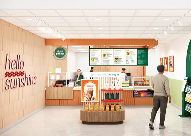 Jamba’s Hello Sunshine prototype brings in vibrant orange and is designed for a frictionless customer experience.Beyond the visuals, it’s designed to improve the customer experience. Guests can either order from an employee or the employee POS terminals can flip, if customers would like to place their own orders.
There are also self-order kiosks, digital screens, pickup zones and streamlined layouts so customers can easily order and grab their food for a frictionless experience.
The new design features the signature orange and Hello Sunshine branding package throughout. The former interior design featured green and earth tones, and green is still present for this health-focused brand, says Tony Maldonado, senior vice president of design and construction of parent company GoTo Foods. But, he adds, “we leaned into the orange because it really pops.”
On the exterior, Jamba is highlighting the orange. And it will highlight the orange in an awning if allowable — especially in a strip center. Drive-thrus also have an orange canopy.
Jamba looked at every aspect of its design for this prototype with the goal of making locations quick and less expensive to build out and also easier to maintain. Plus, says Maldonado, “the modularity of the design means you can incorporate parts of this. Jamba is very diverse with many different types of locations. You can pull this prototype apart.”
Dave’s Hot Chicken
Pasadena, Calif.
It’s unlikely a location of Dave’s Hot Chicken will ever be mistaken for anything else.
The brand puts murals on the exterior of the restaurants “as much as possible,” says Tiffany Vassos, senior vice president of design and construction. “Our locations with more exterior design tend to do more sales-wise. Because we’re a little more disruptive, people know we’re there and it has a ton of energy and spruces up the area we’re in.”
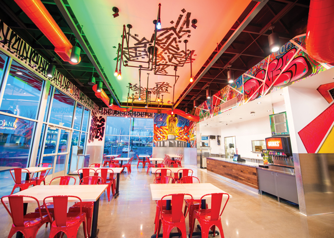 A vibrant experience at Dave’s is reflected through bold graffiti both inside and out.
If Vassos can, she likes to add colored light bulbs on the exterior, especially to outline the roof. With those bulbs, she says, “you can get a lot from very little.”
The exteriors, Vassos says, “are almost a billboard and rope people in with something visually stimulating.”
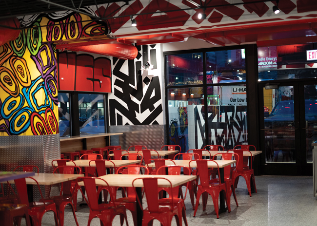 The murals continue inside. “It’s very important to create that vibrant experience,” Vassos says. “We don’t put ourselves in a box but red is very important; and we do a lot with galaxy themes.”
Dave’s works with Los Angeles-based street artists and flies them to new locations to hand and spray paint them. Dave’s is also looking at new materials that can be used for the murals such as a vinyl that can be heat applied because some landlords prefer them not to paint the walls.
Vassos also likes to have a lot of duel halo lit signage and red rope lights in the restaurants “to give us the glow.” And she loves big windows so even if there’s only minimal exterior design “the experience within our spaces will protrude out of the location and give you the glow from far away.”
Inside, “we go pretty crazy,” Vassos says, and the brand might reflect the local location in the mural and an image of Dave, the chicken. For example, in a Denver store, Dave (a mannequin dressed as a snowboarder) sits in a real chairlift hanging from the ceiling. Dave’s always different; there’s a Loch Ness Monster Dave, an astronaut Dave, sporty Dave and movie star Dave.
Dave’s Hot Chicken aims to have the locations all be “siblings, but not identical twins,” Vassos says, which encourages people to check them all out.
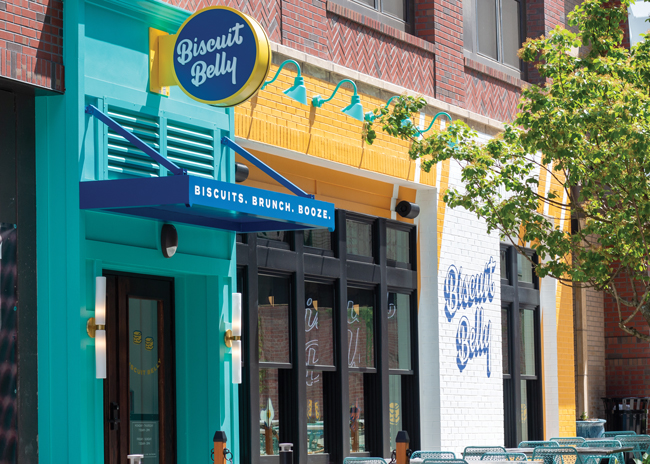
Biscuit Belly
Louisville, Ky.
Biscuit Belly stands out in the fast-casual breakfast and brunch segment with warm and cheerful colors intended to evoke a coastal modern feeling with corals, teals and navy blues, and contemporary design.
The goal of the brand is to be “creative and mischievous,” says CEO and founder Chad Coulter.
 Biscuit Belly is creative and mischievous with a coastal modern feel.
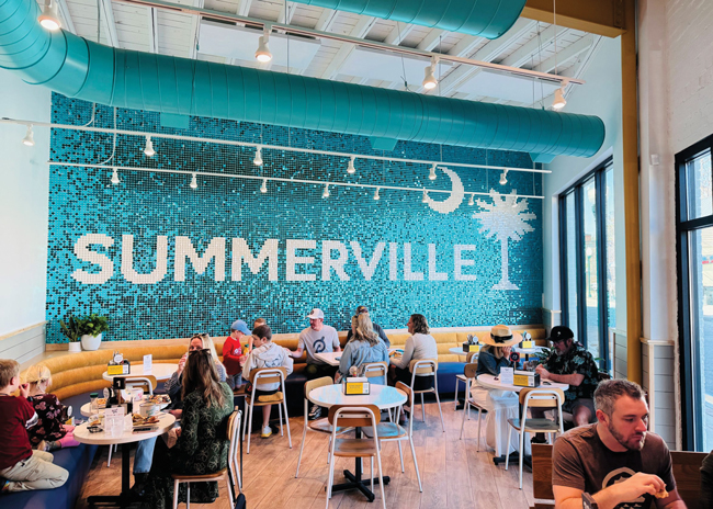
The 14-unit (and growing) chain complements its colors with light colored woods like maple, along with quirky herringbone-style tiles and shimmer walls made from sequins that spell out the name of the location’s city.
Metal ceiling rafters and pipes are also painted in the cheerful brand colors, and fun pendant lights hang over the seating and ordering areas.
Each unit feature murals, too, with the earlier locations using vinyl applied to the wall but newer locations are hand-painted by muralists and feature elements from the local area to make them unique.
Some feature open kitchens but a standard feature going forward, says Coulter, will be a viewing window in the queue line or behind the cashiers into the kitchen prep area. “We’re hoping to get more visibility and appreciation for our scratch-made food,” Coulter says. “We can put signs up saying it but when people see it, it means more.”
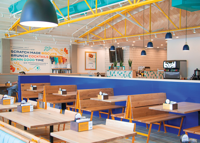
This window, says Ben Novosel, principal and architect, Insomnia Design, Cincinnati, shows the activity rather than a detailed view of the kitchen. Guests, he adds, “can see the bustle back there without seeing everything.”
The Biscuit Belly locations also feature a lot of windows, from at least two directions, says Novosel. “It helps it feel more daytime. The finishes pick up on that, the ceiling is predominantly white. It makes it a more lively.”