 Large, colorful posters featuring fresh vegetables reinforce the brand promise at Fresh Market Café in Mississippi. Image courtesy of Fresh Market CaféOf all the tools available to designers to create a distinctive appearance, none may be more powerful than graphics. Logos, posters, menu boards, photographs, wallpaper, and printed words provide a wealth of possibilities to establish a unique atmosphere, attract the attention of customers, and influence them to make purchases. Also, new technologies such as CNC machines that can precisely cut materials to any shape and digital printers that can stamp images onto almost any building material continue to enhance the design toolbox.
The possibilities can seem overwhelming, though. While there are limitless ways to use graphics effectively and appropriately, one imperative is to always be faithful to the brand and the restaurant concept. “Every iteration of graphics should reinforce the brand every time the customer comes in contact with [it],” says Scott Richardson, founder and chief creative officer, Richardson Design.
Such is the case at Fresh Market Café, a fast-casual concept with two locations in Mississippi. Large, colorful posters of fruits and vegetables catch the eye as customers enter the restaurants. The customers see the words “natural,” “wholesome,” “nutritious” and “hearty” across the walls in big, bold, red lettering in a font that evokes a homemade, artisanal vibe. The images and words connote a natural foods store. From graphics alone, it’s clear that the eatery will feature a menu of healthy, made-from-scratch offerings.
Executed well, anything that serves as the design’s focal point should always have such a strong impact, says Celia Barrett, CEO and principal designer, Barrett Design Studio, and the interior designer for Fresh Market Café. “What is the first thing you see as you enter? What do you feel when you walk into the space? If the answers to those questions give you the emotional responses that you want, you are off to the right start,” she says.
Wetzel’s Pretzels embraces that same philosophy with the way it makes use of graphic elements at its 340-plus locations nationwide. The distinctive logo of a baker with a giant pretzel slung over his shoulder stands out in the front of the snack chain’s plain, white front counters. It’s a fun, whimsical marker for a brand that embraces that spirit, says Martha Lares, vice president, design and construction, for Wetzel’s. It also directs attention to each store’s main sales persuader: the glass-enclosed warming unit containing baked goods.
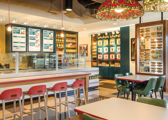 With Toledo, Ohio-based Packo's redesign, Richardson Design opted for a graphics-rich space that paid homage to the restaurant's standing as a local institution. Images courtesy of John Spaulding Photography
Drive Sales with Graphics
“The goal is to create an impulse purchase,” Lares says. In many cases, the aroma of freshly baking pretzels first captures a customer’s imagination. The next marketing goal is to point the customer to the products. Graphics, including signage, logos and imagery, can act like a map guiding customers down a path toward fulfilling the craving the bakery smell creates.
Indeed, graphics can “subliminally direct customers to an item you want them to order,” Barrett says. “You might want to encourage them to order an item that can be made quickly or one that is on the higher end.” This can be done subtly with a slightly higher point type on a menu board or by positioning a likeness of the item in a prominent spot.
Be Succinct and Use Images Judiciously
In a mall environment, the home of the majority of Wetzel’s locations, it’s important to use graphics judiciously, Lares says. “In today’s busy world, many people walk through walls with their heads down, looking at their phones,” she observes.
As a result, restaurants have limited time to catch the eye of the consumer. Restaurants require a sharp message, one that quickly and distinctly conveys what the establishment has to offer. Too many images can garble the message, Lares says.
The same holds true for words on posters, wallpaper and other media. “Copy should be short, to the point and very legible,” Richardson notes.
That doesn’t mean an interior design cannot be graphics-rich. When Richardson’s firm updated branding and interior design for Packo’s Eastern European Kitchen, a Toledo, Ohio, institution known for hot dogs and Hungarian food, it didn’t skimp on graphical elements. The restaurant originated in the 1930s, so, in a nod to its history, the redesign includes reproductions of period photographs and illustrations. Glass-enclosed displays featuring hot dog prints signed by celebrities hang from the ceiling, facing large picture windows.
The signed hot dog images are a long-time Packo’s tradition. Custom wallpaper in the bathrooms repeats the theme. Customers can spot the autographs of luminaries including Toledo-born actor Jamie Farr, best known for his portrayal of Corporal Klinger in the TV show “M.A.S.H.” in this “hot dog hall of fame.”
In the redesigned Packo’s, images and graphics pay homage to history, but interior materials, bright colors (yellow and white) and lighting, along with clean lines, produce a distinctly modern aesthetic. In this case, graphics serve as the primary tool to link the modernized space to its rich history.
 Selecting a logo that can scale for size, from window signs down to takeout packaging, is a key consideration in graphics. Image courtesy of John Spaulding Photography
Scale and Consistency Are Key
Many of the graphics within Packo’s hanging display cases are modestly sized. When reproducing images, choosing the right scale is critical, Richardson emphasizes. “An image might look great on a computer or within a large space but not when it’s reduced to a smaller size,” he says.
This is an important consideration when designing and selecting logos. A particularly intricate logo may look good on a large front sign but could look blotchy when shrunk to fit on a menu or takeout wrapping. One option might be to create a simpler-looking logo for smaller media, but this may create an inconsistent graphic identity for the brand.
Interior and graphics designers as well as branding experts advise all businesses to strive for consistency with the use of imagery, colors and typefaces. To ensure consistency in the graphic identity across the spectrum — outdoor signage, interior decor, menus, packaging and digital media — consider holding a creative brainstorming session that includes the interior designer, graphic designer, lighting specialist and social media consultant, Barrett suggests. Large chain establishments may hire many architects, consultants and construction professionals to design and build franchise locations. Guidelines governing graphics and color palettes are essential to ensure a consistent look — and that extends to online presences, including social media.
Today’s tastes tend toward restraint when it comes to the use of graphic elements within restaurant interiors. This is especially true in shopping malls, where owners have strict design guidelines, Lares says. A few years ago, Wetzel’s redesigned its stores as a trend toward muted, clean designs swept the mall space nationwide. “It’s a minimalist look with lots of white,” Lares says. Historically, Wetzel’s employed bright, vibrant colors and graphics, so the redesign was quite a departure and a big challenge: “How do we present a fun, whimsical brand in a muted world?” Lares asked herself. One answer was the use of subtle pops of color — yellow, blue and orange — in the logo and in imagery in the warming unit and, in some locations, order kiosks.
Use New Technologies
New technology provides designers with novel ways to apply graphics. CNC machines enable the fabrication of custom sizes and shapes of iconic images in many materials at budget-friendly costs. Wetzel’s uses this technology to create detailed pretzel forms that render an impressive appearance. These sculptural elements bring three-dimensional items into play, providing a more textural experience in contrast to two-dimensional media.
Today’s digital printers can apply graphics on many materials — wood, plastic, Corian countertops, glass and ceramic tiles, for instance. New digital printing techniques also offer a durability advantage over the way things were done a decade or two ago. “In the past, you would have had to hand paint these or apply vinyl containing the image that would eventually rub off,” Richardson says.
Wetzel’s also rolled out a new tool, a digital menu board that is graphics-rich, with little text. Digital images move across three panels on the menu board showing how pretzels are made. The graphics-rich screen stands out among the muted interior decor. “I love to see children pointing at the monitor,” Lares says.
No matter what type of menu board used, make sure that nothing stands in the way of its basic function: to relate your offerings to customers. “I’ve seen nice menu boards where some views were blocked by light fixtures,” Richardson says. For a
quick-service establishment, anything that delays customers from making their choices will slow service. Richardson has observed some restaurants that have a right to left counter cue but place the menu board to the left, making it harder for patrons to see. Typography should be clearly legible, even for those who may be a bit nearsighted.
In fine-dining establishments, designers typically use far fewer graphics than in quick-service or casual eateries. Nevertheless, there is room for a subtle use of graphics. Richardson offers the example of a high-end casino restaurant that embossed its logo on custom china dessert plates. The graphic design was true to the classy vibe, while providing an understated branding element.

Don’t Jump the Shark
In the excitement of creating a new design, and with the increasing number of ways to use graphics on many more materials, it becomes easy to fall in the trap of over designing a space. “Sometimes it is hard to let go of a design element that you have fallen in love with, even if it is just one too many things!” Barrett observes. To prevent overdoing it, try out the design on someone whose opinion you trust, she suggests.
Every design element should have a purpose and be in sync with the overall vision. That’s especially true of graphics, which are often easy and inexpensive to add. Many Wetzel’s franchisees would love to put additional colorful posters on their walls, but that would be contrary to what mall owners are looking for and would be against company standards, Lares adds.
Moderation of all things is sound advice for good health. And, as it turns out, optimal use of graphics.


