Pull up a barstool at Dimmi Dimmi Corner Italian, settle in with the regulars and raise a negroni to Nonna, the worldly, quirky Italian grandmother whose life and eccentricities inspired the restaurant’s design.
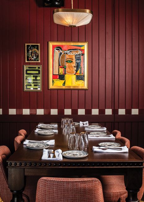 The custom-crafted Nonna’s Table sits beneath a painting by local artist Natalie Osborne, who specializes in striking, colorful portraits of women. Images courtesy of Dimmi Dimmi Corner ItalianNonna doesn’t actually exist — she’s a fictional character on which the conceptual narrative was built — but if she did, she’d feel right at home at Dimmi Dimmi, Cornerstone Restaurant Group’s fresh new take on Chicago’s classic neighborhood Italian restaurant.
Opened in August in the city’s Lincoln Park neighborhood, Dimmi Dimmi is the latest addition to CRG’s portfolio of restaurant brands, which also include Sol Toro, Urbanbelly, Chef Bill Kim’s Ramen Bar, Michael Jordan’s Steak House, Hi-Fi Chicken & Beer, and The Table at Crate. And it’s the company’s first take on Italian, part of CRG’s diversification-driven growth strategy.
“Italian stood out as something that we didn’t yet have,” notes Cornerstone CEO Josh Zadikoff. “We’d also had a seedling of an idea for a while around what we envisioned a quality- and hospitality-focused neighborhood Italian restaurant could be in Chicago in 2025. We wanted to make sure it would be authentic — not strictly authentic Italian, but authentic to what we do at CGR, how we present food and manage hospitality. We didn’t want it to be kitschy or concept-y, but it still would have a clear viewpoint or essence of neighborhood Italian.”
The project began to take shape in earnest when CRG found a location that seemed tailor-made for Dimmi Dimmi. John Tarantino, owner of the historic Armitage Avenue building, had operated Tarantino’s
Italian restaurant on the first floor there for 30 years and was planning to close it. Real estate connections brought the two parties together, and an off-market deal was stuck for CRG to lease the space and transform one legacy Italian concept into a new one.
“John wanted to be very careful about who he bought in to take over the space,” Zadikoff notes. “We spent a lot of time together, letting him get to know us and our ideas for Dimmi Dimmi, and ensuring him that we embraced the neighborhood and the sense of community he’d built at Tarantino’s. It was really a kind of lovely, organic way to pass the torch from what he’d built to what we envisioned doing. We didn’t want to be Tarantino’s 2.0 — our vision was different — but we have some fun nods, including on the menu. For instance, one his most popular dishes, a fusilli with tomato cream and sausage, was the inspiration for our chef Matt’s Orecchiette Tarantino.”
 The two largest booths carry the dominant red color palette, and elevated booth platforms have a playful checkboard pattern created from vinyl composite tile. The pattern is picked up in wall trim as well.
A Nostalgic, Layered Approach
Between February and August 2025, Tarantino’s was transformed into Dimmi Dimmi, where staff serve “red sauce classics with a wink, house-made pastas with a little flair and cocktails that go down dangerously easy.” Chicago-based studio Siren Betty Design was commissioned to lead the redesign effort, which focused on honoring the space’s legacy while giving Dimmi Dimmi its own unique vibe.
“We first wanted to learn about the history of the space and see what we could lean into in terms of existing materials and features as we thought about what Cornerstone wanted to achieve with their new concept — keeping that story of the old Italian restaurant, but setting it apart with a new narrative,” says Nicole Alexander, founder and principal designer at Siren Betty. Working with HiFi Brands, the Oak Park, Ill.-based branding and graphics team that was brought in early on to assist with concept development, helped solidify the design direction, according to Alexander. HiFi suggested the name Dimmi Dimmi, which in Italian translates to “tell me, tell me.” Picture a group of girlfriends out for dinner and cocktails, sharing gossip and having a great time.
“That’s really when the idea for Nonna emerged, and for designing the restaurant around what we imagined her own place might have looked like,” Alexander says. “It could be a space reflecting her interesting, crazy, long and vibrant life, a place where you might find her drinking, gossiping and sharing stories with her girlfriends.”
Siren Betty interior designer Noelle Saeger adds that the idea was to take a layered, evolutionary approach to expressing that narrative. “We wanted to peel back the layers of Nonna’s life, incorporating elements that she might have had in her childhood and when she was a young adult,” she says. “So there are bold, playful and poppy elements. We also layered in traditional elements — maybe as she got older and refined her style a little. So there are a lot of colors, textures and patterns and a lot of vintage touches to the design, but they all feel like they’ve come from the same woman as she and her space evolved over time.”
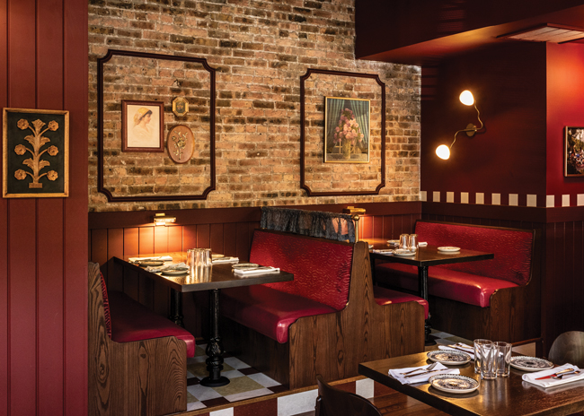
Transformation of the 1,800-square-foot first-floor restaurant was largely cosmetic. Existing hardwood floors were refinished and original brick walls left exposed. The original tin ceiling lacked insulation from the apartment upstairs, so a new acoustical ceiling treatment was installed.
“Acoustics was something we knew we needed to get ahead of. We knew that old tin ceiling, although it was beautiful, could be a problem for the type of higher-energy space that Dimmi Dimmi would be,”
Alexander says. “We were worried about the tenants upstairs, but also about guests being able to comfortably hear each other because there are a lot of hard surfaces. Our solution was to leave the tin ceiling in place so it would be preserved, but just below it, we installed a slatted acoustical ceiling system. It works really well with the design and feels intentional and timeless.”
The basic layout of the space remains the same as well, with back-of-house and basement prep kitchen and storage areas requiring little more than new equipment installations. The bar, however, was lengthened to make it a stronger focal point. “Thankfully, we didn’t have to move the bar. The space is classic Chicago shotgun-shaped with bar on the left,” Zadikoff notes. “But we wanted this to be a welcoming neighborhood place where you can just pop in and pull up a seat at the bar, so we needed it bigger.”
Now with 14 seats — teal vinyl, midcentury-style stools — the bar has a dark-stained wood top, a nod to the original Tarantino’s top. Along with the teal barstools, Saeger designed the bar face to add a pop of color. “There’s traditional wood and brass on the base of it, but we added a really fun, high-lacquer red wall covering to the top half of the bar face where it wouldn’t get damaged,” she says. “It’s reminiscent of an old classic car painted shiny red and has a sort of 1950s aesthetic that, along with a palette of mostly reds and maroons, appears throughout the project. We picked up that ’50s car aesthetic for the upholstery detailing in a clamshell booth at the back of the dining room as well.”
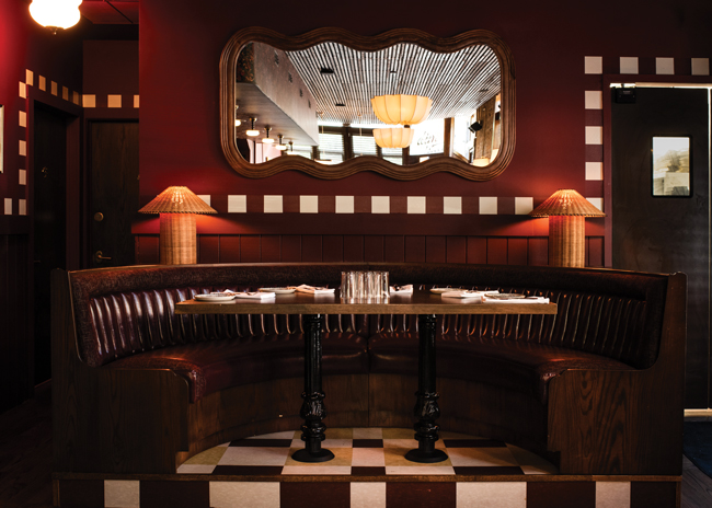 Classic 1950s automobile aesthetics show up in the upholstery detailing of a clamshell booth at the back of the restaurant.
Elements of Art Add Energy
The soffit running above the bar is clad in wall covering as well — this one an abstract, vintage floral. “That wall covering wraps around the entire soffit, on the face and the underside,” Saeger notes. “And it also speaks to the cafe curtains in the windows, which have the same pattern but on velvet, for another layer of pattern and texture.”
In fact, the designers pulled heavily on an eclectic mix of patterns, colors and textures to achieve the desired effect for Dimmi Dimmi. Where exposed brick isn’t present, walls and wainscotting are painted deep plum-red. Red is the color of the two six-seat Pullman booths and loose seating in the center of the space. Smaller booths along the opposite wall have backs upholstered in maroon-and-white diamond-patterned fabric against green seats, a nod to the classic Italian red-and-green color combo. Chairs at the eight-seat, custom-crafted Nonna’s Table are upholstered in textured pink-and-red plaid fabric. Teal reappears with velvet window seats at the front of the restaurant. And, while the balance of tabletops are dark wood, the two window tables have Calacatta Viola marble tops veined with reddish purple, which adorn the host stand and service stations as well.
“We initially started with a lot of green in our design but then realized there was an Italian restaurant not too far away that used a lot of green, so we pivoted,” Alexander says.
“We began looking at traditional Italian patterns in vintage imagery and especially in old Italian movies. We focused on the 1950s and ’60s, which is where we wanted our storytelling to start, to get a sense of what the colors were then. That helped us pivot to the maroon reds and plums that we used predominately throughout.”
The team’s research on vintage Italian imagery also led to their embrace of diamond and checkerboard patterns. In addition to the fabric on the small booth backs, a section of hardwood floor beneath Nonna’s Table is stained in an artistic diamond pattern, evoking an area rug. “Where we had to replace some of the original wood flooring, we kept it raw and had an artist create the pattern before we put the final coat of stain on it,” Alexander says.
Checkerboard-inspired patterns appear on the 6-inch-high booth platforms on both sides of the room as well as beneath the clamshell booth at the back. For the platforms, Saeger created the patterns using budget-friendly vinyl composite tile. “It’s an old and historically kind of institutional flooring choice, but it’s suddenly one of my new favorite materials — which is funny because it’s so cost-effective,” she notes. “On the top of the platforms, we did kind of a loose checkerboard created with three colors. On the face of the steps, it’s alternating red and white. That motif was also used as a wall-trim pattern, with white squares painted on red running throughout the room. HiFi Brands picked up the checkerboard/diamond pattern, too, as a graphic element on the menus, on matchbooks, on the website, etc., which ties everything together nicely. It’s very classic Italian, but also pretty mod.”
That nostalgic yet modern spin, applied to everything from graphics and branding to design, food, drinks and hospitality, ultimately brings Dimmi Dimmi to life just as Zadikoff and team envisioned — a 2025 version of the classic neighborhood Italian restaurant. While small in size, its look and feel are vibrant, welcoming, fun, a little eclectic and a little noisy — much like Nonna herself was imagined to be.
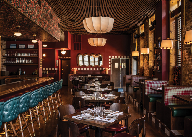 Starting from a base of original wood floors and exposed brick, the designers fashioned a fresh take on classic neighborhood Italian with an eclectic mix of vintage and modern elements.
Project Team:
Ownership: Cornerstone Restaurant Group
Executive chef: Matt Eckfeld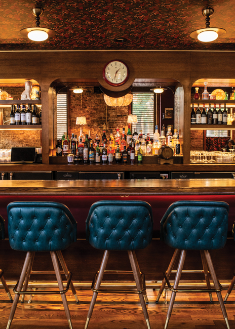 To make it a focal point, the original bar was lengthened and a high-lacquer red wall covering was added to the top half of its face, against which teal blue barstools pop.Design: Siren Betty Design
Graphic design: HiFi Brands
General contractor: Infocus Builders
Equipment: RJS + Associates
Artisans: Zach Rose, Navillus Woodworks, Susan Williams, Natalie Osborne
Snapshot
Concept: Neighborhood Italian
Location: Chicago
Opened: August 2025
Project type: Renovation
Size: Main level, 1,800 square feet (including 500-square-foot kitchen); basement prep kitchen and storage, 1,900 square feet
Seats: Bar, 14; dining room, 64
Build-out: 8 months
Average per-person check: $50 to $60
Design highlights: Original hardwood floors, exposed brick walls, vintage floral soffit wall covering and matching velvet cafe curtains, classic 1950s car-inspired booth detailing, red/maroon color palette, entry ceiling painting, vinyl composition tile booth platform trim, diamond-patterned booth upholstery, teal vinyl barstools, Calacatta Viola marble tabletops, custom eight-seat Nonna’s Table, wood-slat acoustic ceiling treatment, brass trim, curated works by local artists