What’s driving the design of limited-service restaurants today? Simple yet creative choices seem to be a common theme among these restaurants. Regardless of fare offered, they share intentional, impactful touches for a lasting impression.
Small Space, Big Impact
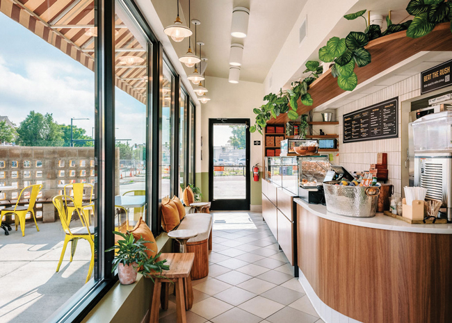
In restaurants, every square foot counts, so every choice must be meticulously considered to support both function and vibes. Two Denver concepts that deliver on both are Little Owl Coffee shop and Maria Empanada, an Argentinian restaurant that bakes and serves fresh empanadas all day.
Little Owl and Maria Empanada both have multiple locations, but their Denver locations operate out of tiny spaces — 400 square feet and 512 square feet, respectively. Seating is limited at both, with a couple of seats at the bar, a small sofa and a drink rail at Little Owl.
Maria Empanada, which opted for a smaller location in Denver “to condense things,” according to Aleksandra Kaplan, partner at Swan Dive Design Studio in Denver. And condense things they did, as the site, she says, “is literally an ordering counter and a pickup area.” Maria Empanada also has a drink rail outside for patrons.
Kaplan utilized a less-is-more approach, creating small, unexpected moments throughout each space. “If you give people too much time to pause in these spaces, it can feel cluttered and slow everything down,” she notes.
At Little Owl, Kaplan incorporated wabi-sabi, the Japanese philosophy of finding beauty in imperfection.
“We wanted to keep the perfection of the coffee shop but almost break it in this beautiful way, and celebrate it,” she explains. To “break” it, she used a vibrant plum color in a high-gloss finish to contrast with the space’s natural materials. At Maria Empanada, she incorporated ceramic pitchers in the shape of penguins for a whimsical flair.
 Mamahuhu locations are designed to promote social interactions. Image courtesy of Mariko Reed
Community Integration
Mamahuhu operates four restaurants in California’s Bay Area. One of the fast-casual brand’s goals was to encourage social interaction and operate as a third space — a realm usually occupied by coffee shops. They host their own running and mah-jongg clubs. Other community groups also use the restaurants as meet-up spots.
“The spaces are conducive to communal gatherings, but also to very efficient takeout,” says Bonnie Bridges, AIA, principal, Studio BBA, San Francisco.
To invite community, Bridges mixed seating — benches with two-top tables that can be pushed together, booths, and high-tops with fixed stools.
“We’ve designed the booths so the height of them and the way they’re laid out, kids spill out of them, they’re very social,” Bridges says. The dividers between them are low, which encourages interaction.
Mamahuhu’s design has evolved since the first location opened in 2021. For a fast-casual restaurant, “people said it was too bougie, too nice,” says Bridges. “We had to switch to lighter woods, mostly maples and white oaks, instead of walnut.” Utilizing lighter bent woods and laminate made the design more approachable and relaxed the vibe for socializing.
 Image courtesy of Mariko Reed
Cohesion Meets Creativity
Some chains are moving away from uniformity. All four locations of Field & Social in Vancouver, British Columbia, have different designs, yet all feel like part of the same brand.
“They want each location to tell the same story but be completely different; no elements are alike, and each space lends itself to its own personality,” says Ruth M’rav-Jankelowitz, JDG, NCIDQ, president of Janks Design Group in Vancouver.
One location has an industrial vibe but another has warm woods that contrast with white walls accented with bronze pendant lamps and bronze and wood shelving.
M’rav-Jankelowitz designed a third Field & Social, in a food court with lots of dark colors, to be “very white to stand out,” she says. The fourth location is in a historical building and features light blush colors for a softer feel.
Habit Burger & Grill also likes its locations to be slightly different. A recent store in Orange County, Calif., features a mural of a local pier.
“People love the comfort of brands but want the excitement of traveling and things that are new,” says Jeffrey Teuton, director of interior design, Ideation Design Group, Phoenix. Having local art in each one “can generate some loyalty,” he adds. “There’s that sense of ownership.”
 Each location of Field & Social has its own design and personality. Images courtesy of Christine Pienaar Photography
Co-Branding Picks Up Steam
Co-branding is another hot trends for restaurant groups with multiple brands.
Auntie Anne’s and Cinnabon recently opened their first co-branded unit in downtown Chicago. Parent company GoTo Foods is diversifying beyond malls to streetside development.
WOWorks is pairing its superfood bowl and smoothie concept, Frutta Bowls, with many of its other brands “because they’re all in the same category,” says Kelly Roddy, CEO, WOWorks, St. Petersburg, Fla. Placing Frutta Bowls appeals to a younger clientele, he says, and customers may try food from the other brand while they’re there, “so we’re seeing a good add-on.” It also brings in customers at quieter times of the day since Frutta Bowls is popular after school. The branding in these locations is merged, as is the space inside.
Earlier this year, FAT Brands, Los Angeles, opened its first co-branded Roundtable Pizza and Marble Slab Creamery location in Oakland, Calif. Adding a dessert option with pizza can increase check averages, says Mason Wiederhorn, chief brand officer. Including the ice cream concept requires very little space. “We’re usually taking over some front counter space that’s minimally utilized,” he says.
FAT Brands has also co-branded Roundtable with FatBurger, which works well, Wiederhorn says, since the burger concept is busiest at lunch and dinner, and the pizza concept is busy for dinner and late-night business. Having two brands under one roof reduces build-out costs for new locations. The brands are integrated with a “neutral design scheme that pulls elements from both,” he says. In the new-build kitchens, FAT Brands is combining makelines.
 Unexpected moments in Maria Empanada add to the less-is-more aesthetic. Image courtesy of Fernando Gomes
Bakery Boom
Baked goods can bring a freshness cue to restaurants, and many brands are bringing them front and center.
Einstein Bros. Bagels is rolling out its Elevate the Morning prototype and expects to have four stores open by the end of the year. The design has made the bagel case more prominent. “The bagel is clearly our hero, and we wanted to showcase it as the heart of what we do,” says Leslie Haver, senior director of store design. “We did this glass case so there’s no frame, no interference — almost like a jewelry case. It’s the first thing we want our guests to see and smell.” The new stores have an elevated design throughout. “We provide a premium food, so you have to match that with the in-store experience.”
Paris Baguette is opening stores with its domed island display of pastries, which it brought out from the wall so customers could walk all around it. “It almost looks like a furniture piece, so the island itself is differentiated. No one has anything like it,” says Brian Egan, vice president of development. Sales have increased at the stores since the redesign, per the chain. “It really is an enhanced shopping experience for the guest as they walk through this sea of food.”
 The minimal design of Smith Coffee is punctuated by unexpected colors, textures and design elements. Image courtesy of Spacecrafting
Minimalist Vibe
Smith Coffee & Cafe in Eden Prairie, Minn., has a minimalist design that makes a big impact. Light woods, neutral walls, grays and muted greens are punctuated by pops of color via a burgundy booth, salmon pink banquette and vibrant orange coffee roasting machine, which provide striking contrast. Cori Kuechenmeister, IIDA, director of design, senior associate, Shea Design, Minneapolis, wanted to create a timeless quality “so you can change it out if it ages out and to keep it relevant.”
 Image courtesy of SpacecraftingKuechenmeister wanted to reflect the quality of the product Smith Coffee serves “and what the brand embodies,” she says. The simplicity lets other elements shine, she says, such as the product packaging, which Smith Coffee spends a lot of time on. “So you’re getting these smaller moments, these brand touches that are very thoughtful so you can have a quieter space.”
With minimal design, it’s important not to be cold or sterile, Kuechenmeister says, so she included greenery, textures and a graphic patterned wall covering to make sure it’s still “inviting and approachable.”
Taco Viva in Phoenix has a barely-there design. The ordering counter is made from corrugated metal to simulate a taco stand; walls are painted white with simple line-drawing graphics. The ceilings are exposed, and the floors are concrete. Bright orange chairs and the orange ordering counter bring color to the space, says Brian Laubenthal, LEED AAP, principal, Aline Architecture Concepts, Scottsdale, Ariz.
Playful Design
In contrast to minimalism, some fast-casual restaurants are opting for a more playful tone. Noble Chicken, Cincinnati, Ohio, features a chicken with a mohawk logo and a fun interior that includes cheeky signage and chickens parading across the ceiling.
Egg on a Roll, which has four locations in Minneapolis and Sioux Falls, S.D., features electric blue, bold wall coverings and skateboarder accents. “It’s not scared to be dramatic,” says Kuechenmeister, who designed it to differentiate among the many breakfast concepts. It’s cost-effective, she says, and easy to replicate at new locations.
Hayworth & Finch is a fast-casual French restaurant in Wilmington, Del. Its name and logo come from characters the three founders developed. Basil Finchley is a down-to-earth bear; Hayworth, a wiry, crazy bird. “We want people to come in and be happy,” says Shannon Stevens, partner and creative director.
The logo is quirky and charming, and the restaurant features a number of small and large moments to play up the cuteness.
The bathrooms were designed to be Instagrammable with wallpaper featuring Hayworth and Finch. Outside, a striped yellow awning informs customers that the restaurant is French — it’s designed to look like a movie marquee playing the film “Hayworth and Finch.”