In December 2024, Yum! Brands opened the first location of Saucy. Located in Orlando, Fla., this KFC spin-off specializes in chicken strips. But, according to Christophe Poirier, chief new concept officer for Yum!, Saucy isn’t all about the chicken, despite the KFC connection. The chicken is a delivery vehicle for the chain’s 11 sauces, he says.
However, Saucy isn’t just about the sauces, despite the investment Yum! made in developing flavors like spicy mango chutney and jalapeno pesto ranch. Instead, Saucy is about the experience and the feelings it evokes in guests.
“In any concept, the most important thing is to have tension,” says Poirier, a native of France with decades of restaurant brand experience on his resume. “The tension of ‘Yes, I want this,’ creates desire. And at the same time, the tension is, ‘I need to feel cool, and I need to feel I belong to that place.’ I think, with Saucy, this is what we have accomplished,” he says.
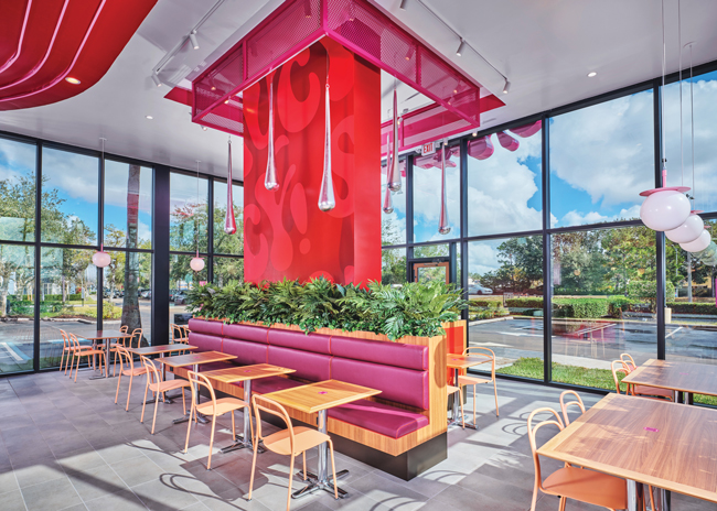 Much of Saucy’s seating is built around a large rectangular pillar in the middle of the dining area. Images courtesy of Saucy
Snapshot
- Project Team: ROWE Creative Union, Jefferson Architects, Profitality Labor Guru
- Headquarters: Louisville, Ky.
- Concept Owner: Yum! Brands
- Concept Description: Saucy is a bold new restaurant concept developed by KFC and owned by Yum! Brands. It celebrates customization and global flavors through chicken tenders and 11 unique, chef-crafted sauces. Focused on a made-to-order philosophy, Saucy pairs its crispy tenders with a curated selection of sides and beverages in a tech-forward, hangout-friendly atmosphere designed for flavor-lovers and next-gen diners.
- Unit Count: 1, with plans to rapidly expand the test concept in 2025
- Location of New Store: Orlando, Fla.
- Opened: December 2024
- Size: 2,900 square feet
- Real Estate: Freestanding
- Design Highlights: A bold aesthetic featuring pink as the signature brand color, kiosk-based ordering, drive-thru lanes, and programming such as live entertainment to encourage community engagement.
- Build-out Time: Construction was completed in under four months, with the entire project, from initial concept to grand opening, delivered in under 10 months.
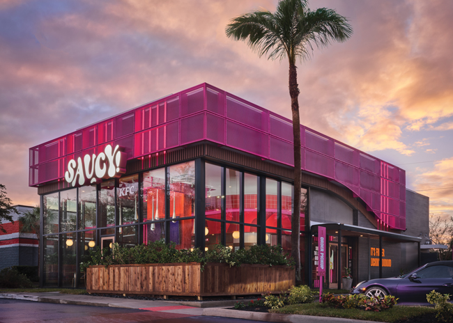 The building’s exterior features layers of material, such as signage on top of pink metal mesh, along with floor to ceiling windows.
Young at Heart
It should be no surprise that younger guests are the target of a restaurant concept that’s focused on helping guests feel cool and provides a sense of belonging. With its food and design, Poirier says the brand is meant to appeal to Gen Z.
The concept won’t age with its audience, though. Instead, Poirier wants Saucy to stay up to date with the next generation, starting with Alpha — and beyond.
“My target audience? I will answer with my mission, which is Saucy is forever young,” says Poirier. “And this is why our tagline is ‘Be bold. Stay Saucy,’ which means that regardless of your age, it’s an attitude. Saucy has a double meaning. It can be about the sauce, but you know the double meaning of Saucy — it’s irreverent, it’s bold, it’s badass.” More than that, he says, the concept is a place where “we love, we wow, we shine, we grow.” This is the foundation for the both the guest and employee experience as well as the design itself.
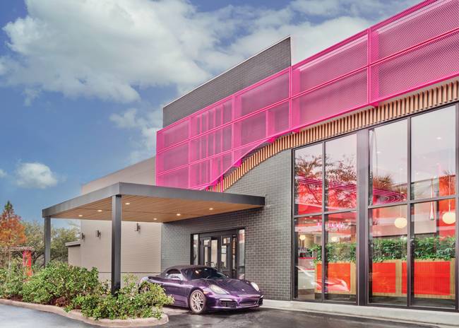 The design utilizes a door instead of a window at the drive-thru. This shows the chain’s operations have nothing to hide, while helping build connection between guests and team members.
Layer Upon Layer
Irreverent. Badass. Growing. Loving. Wowing. These are big ambitions for a chicken tender restaurant — ambitions that can only be achieved with a particularly strong vision.
Saucy, then, used what Poirier called the MAYA design principle: Most Advanced Yet Acceptable. In short, push the design as far as possible without alienating guests.
As Poirier tells it, selecting pink as the brand’s signature color was key to achieving a MAYA design. Pink stands out in the QSR/fast-casual space in particular, he says, contributing to Saucy’s distinct identity.
“I always remind my team, pink is a new red. It is a color that is championing equality, it’s a color that is championing inclusion. It’s a color that is championing belonging, so that was really the ambition behind it.”
The use of pink is clear from the exterior of the restaurant, where a large LED Saucy logo sits against a pink metal grating that wraps around the building. This feature is particularly notable for its layers. The sign itself is made up of separate letters, each several inches thick. Behind and below the metal grating are wood-style vinyl slats, creating multiple levels at first glance. This approach is not just visually interesting, but it also signals the brand experience found within.
“When a building is flat, it means that the experience will be flat. Saucy has more depth, and it’s more profound than just a flat logo. So that was the intention behind it,” Poirier says.
This is far from the only notable aspect of the exterior. One of the restaurant’s most photographed spots is a sign on the exterior proclaiming, “It’s finger lickin’ goooood,” a play on the parent concept’s tagline.
The building features floor-to-ceiling windows, letting in more natural light for employees and dine-in guests. These windows, says Poirier, are kept free of decals, LTO advertisements and anything else that could clutter the space. “Employees and customers, they want to be in a place with a lot of windows, with green plants. Nobody wants to eat in a NASCAR car with a lot of price points and logos,” he says.
Extra attention was also given to the drive-thru experience.
The menu area features more pink elements including on an overhang that shields guests while ordering. At the pickup spot, there’s no window. Instead, a door connects the kitchen to the customers. This design choice shows that Saucy has nothing to hide about its operations, says Poirier. It also allows for more connection between staff and guests, creating a better experience for both.
 The POS area features touch-screen ordering, neon lights, and plenty of pink and red.
A Designed Interior
While Saucy’s exterior is eye-catching, the interior seeks to surpass it. The centerpiece of the dining area is a large rectangular pillar in pink and red. This pillar is surrounded by pink metal grating at the ceiling, similar to the grating used on the exterior.
Descending from the ceiling are what Poirier calls the drips. Made of resin coated in reflective silver paint, they are perhaps the restaurant’s most distinct design element. They are meant to call to mind sauce being poured from a bottle. “Because we are selling sauce, you can see that the drips are real drips, shining drips,” creating a dramatic effect, Poirier says.
Much of the restaurant’s seating is built around this pillar and the accompanying design elements. Here, guests can choose from four distinct seating areas. These are created with small divider walls topped with real plants, which help calm the space.
“With a building like this, which is kind of big and tall, it cannot be intimidating. It is beautiful and sleek and sharp, a lot of glass, concrete, neon, so you need some green,”
says Poirier.
On one side of the pillar is a small banquette with seating for eight to 10. This piece is upholstered in purple faux leather with red-orange trim and pink stitching — a level of detail not commonly found in
QSR concepts, notes Poirier. On certain nights, the tables here are moved to make room for a DJ, he adds.
Adjacent to this are two small separate sections, each with a solid wood two-top and red slats attached to the divider.
The restaurant’s feature table is between these two-tops. This space offers U-shaped soft seating in orange. While the restaurant’s other tables are wood, here the table is resin, with pieces of broken glass throughout. This creates a distinct experience for guests at this space, says Poirier.
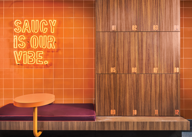 Saucy’s employee area is more than an afterthought, featuring upholstered bench seating along with design touches like orange wall tile and cubbies with mirrors
No Afterthoughts
The POS area is the other main section of the front of the house. Not surprisingly Saucy’s design team spent significant time turning this into a space that goes far beyond functional.
The key colors in this space are red and pink. The pink, especially, can be seen in a set of four long, thin neon lights. These start at the floor on one side, run up to and across the ceiling, curve with the POS station, and then run back down the wall on the station’s opposite side.
This element is another example of the layering that is a key part of the Saucy design. “Do you want to spend your life with somebody who is flat and vanilla? Or do you want to spend life with someone with different layers? I think life is more interesting with more layers,” says Poirier.
More red and pink can be seen at the ordering kiosks. This set of four screens is attached to a wall with vertical red strips. Guests are guided here by five blocks hung overhead spelling out “Order.” On the bottom of these blocks are QR codes that point to fun social media posts. The QR codes offer a sense of discovery and surprise for guests.
With so many strong colors and eye-catching elements, the design team added a bit of warmth through the pickup shelves next to the kiosk. While the shelves themselves are metal, it is surrounded with a wood-style finish that helps calm the space and allows the eyes to rest.
The POS counter itself is clad in vertical white subway tile with orange grout, Poirier notes. This same subway tile extends to the back of the POS space. Using higher end materials in this space, he says, is an investment in the happiness of the concept’s employees — one that he expects to pay dividends.
“If a team member has an A-plus experience, he will be happy and smiling and he will give an A-plus experience to the guest,” Poirier says. “If the team member is upset and his experience at Saucy is a C-minus, the guy would be grumpy, in a bad mood. Do you think he will be smiling with the guest? No. So team member experience defines the guest experience.”
This philosophy is even more clear in the employee break area in the back of the house. While this space is completely out of sight to customers, Saucy’s designers put real thought — and money — into the area. The space features bench seating with purple upholstery, providing a space where team members can sit down during breaks or before or after their shifts. This area also features orange wall tiles and an orange neon sign declaring “Sauce is our vibe.”
Next to the bench are the employee cubbies. Each is equipped with two power outlets and a mirror — a nod to the “look good, feel good” idea.
This isn’t the only usually neglected restaurant space that Saucy’s designers paid attention to. In this restaurant, the restrooms are a key attraction, says Poirier. Restrooms are outfitted with bright red wall tiles that almost reach the ceiling, while the ceiling itself is painted saucy pink. Music from the dining area is piped into the restrooms as well.
“If the bathroom has music with cool vibes and a cool design, it’s another element,” says Poirier. “You notice it? That’s great. You don’t? It’s not a problem. But we want people to say, ‘Wow! Did you go to the bathroom? Because these guys, they have some cool music inside, and it’s a cool vibe.”
Engineering for Beauty
With only one Saucy restaurant in existence, Yum! is now focused on learning from this operation. The company, says Poirier, is examining every aspect of the operation and design to make future restaurants run more smoothly, look better and maybe even cost less to build.
At this point, though, it’s too soon to say what may change in future stores.
If Poirier and his team do engage in value engineering, it won’t come at the expense of the restaurant’s look and feel. The concept is built around making guests feel a sense of belonging along with a sense of cool. Saucy restaurants to come will stick to that approach.
“We are now tearing down every single aspect,” Poirier says. “It’s about looking at how to engineer these things to make it so sleek and so lean and so beautiful.”