Who doesn’t love a French bistro? Intimate and elegant, these restaurants can, with a few design features, transport diners all the way to Paris.
These inviting locations typically feature a lively bar, some cozy nooks and a casual menu. American designers are putting their own spins on French bistros and here we look at three very different designs — one more upscale, one very cozy and a third offering subtle references to French flower markets.
Bon Delire
San Francisco
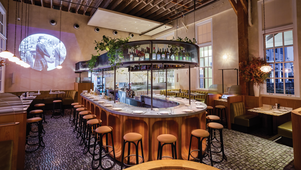
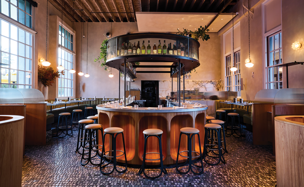
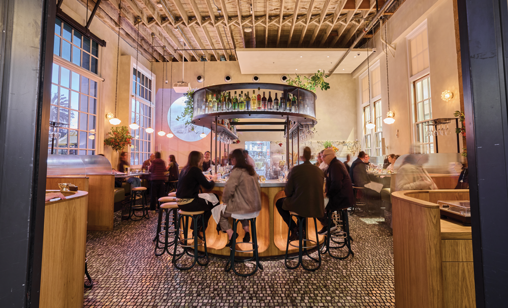
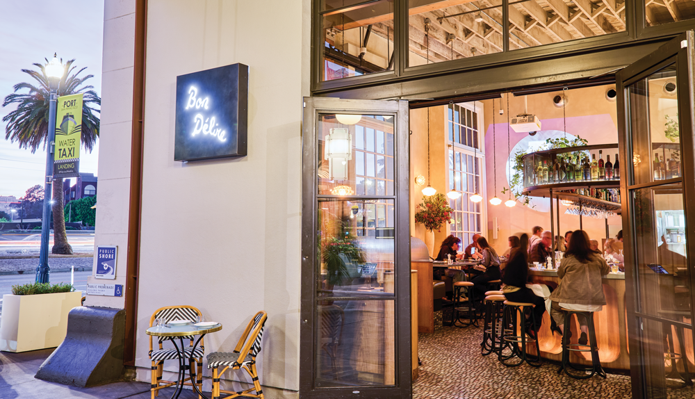
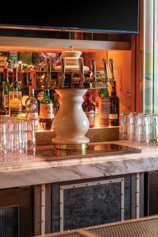
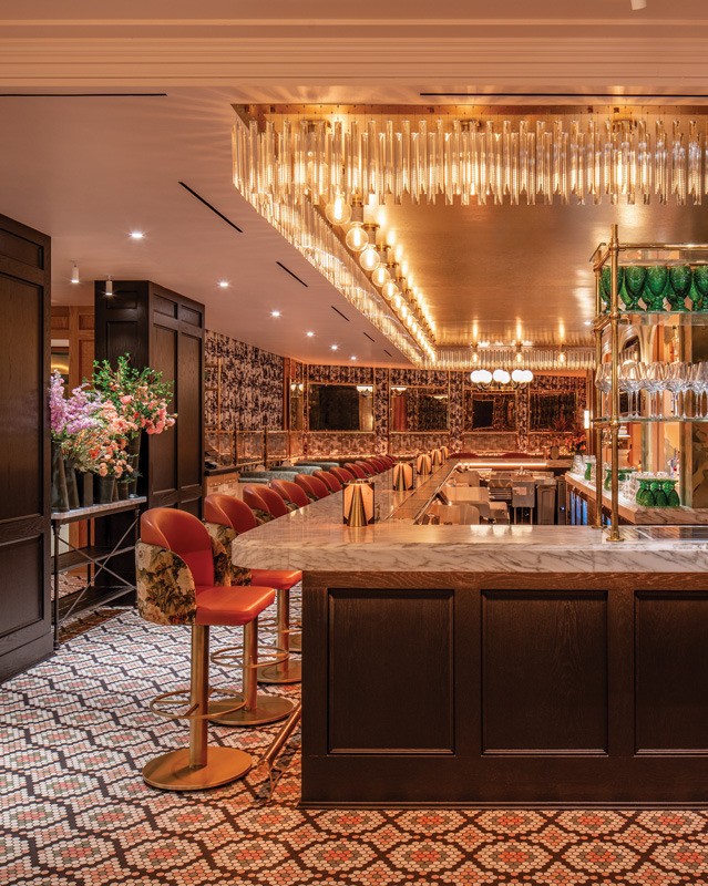
A horseshoe bar anchors Bon Delire, a French bistro that opened in December 2024 near the San Francisco waterfront.
“The owner wanted to bring a little slice of Paris to San Francisco and that horseshoe was the starting point,” says Brett Terpeluk, principal, Studio Terpeluk, San Francisco.
He also started, he says, with a “beautiful historic structure, a jewel box of a space, adjacent to the most significant promenade in the city.” The almost 1,300-square-foot, 50-seat space has high ceilings and large windows.
“My intent was to create a space incredibly dense with texture and color and a balanced variety of forms,” says Terpeluk. He took the curved bar one step further and created scalloped wood detailing in the wooden bar front, creating “an intimate cocoon” that offers “the tactile quality of being able to run your hand over this curving, smooth, scalloped form.”
Contrasting with the wooden bar front, the bar top is cast zinc, for a very Parisian feel. Bottles and glasses are stored above the bar, in a matching horseshoe-shaped structure made of wood, metal and perforated metal, which diffuses the energy and light. The shelves are wooden to keep sound down when bottles are replaced. Dotted in with the bottles are plants “to create softness and an organic quality,” Terpeluk says.
“I loved working with this dynamic between the soft and the hard and how the light hits the curves and conveys a softness of form,” Terpeluk says. “Zinc and steel and the white oak are all hard but there’s a softness, a malleability in them.”
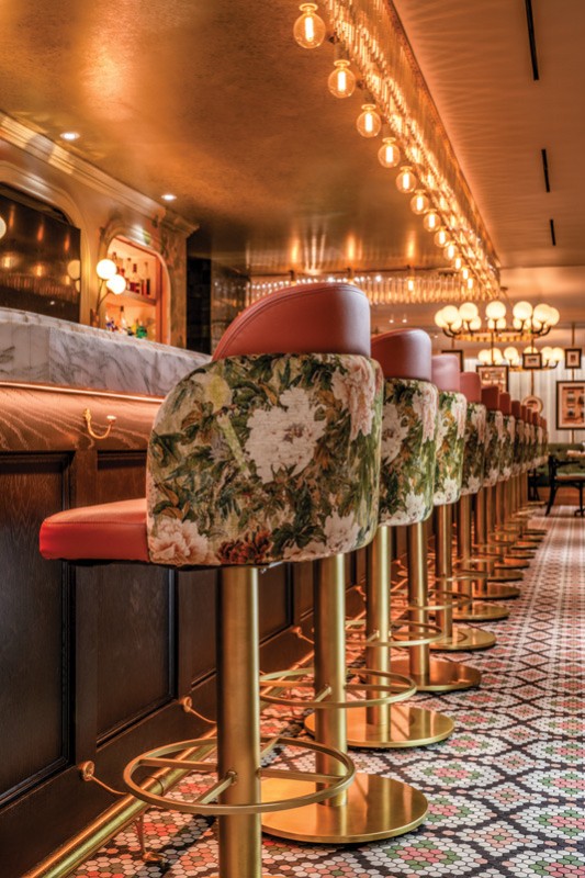
Bon Delire’s floor is made of small fragments of green marble, laid out in a grid pattern “to convey a sense of brilliance or being broken down,” Terpeluk explains. “We wanted a flooring that was not uniform but had a lot of visual interest and could draw the eye through the space.”
The lighting is very important in Bon Delire and Terpeluk wanted it to be “just soft enough to accentuate the form and the curvature of the bar recesses,” since the bar is the primary focus. “We were rigorous about how we selected the lights to animate the space and all can be dimmed to 24 kelvin, a candlelight-like temperature so the overall impression is very warm with some dynamic shadow pattern.”
The restaurant features some vintage 1960s German blown glass lighting — two pendants and three wall sconces made with amber glass that creates organic patterns on the walls. The other pendants are antiques — Parisian lighting dating to 1915.
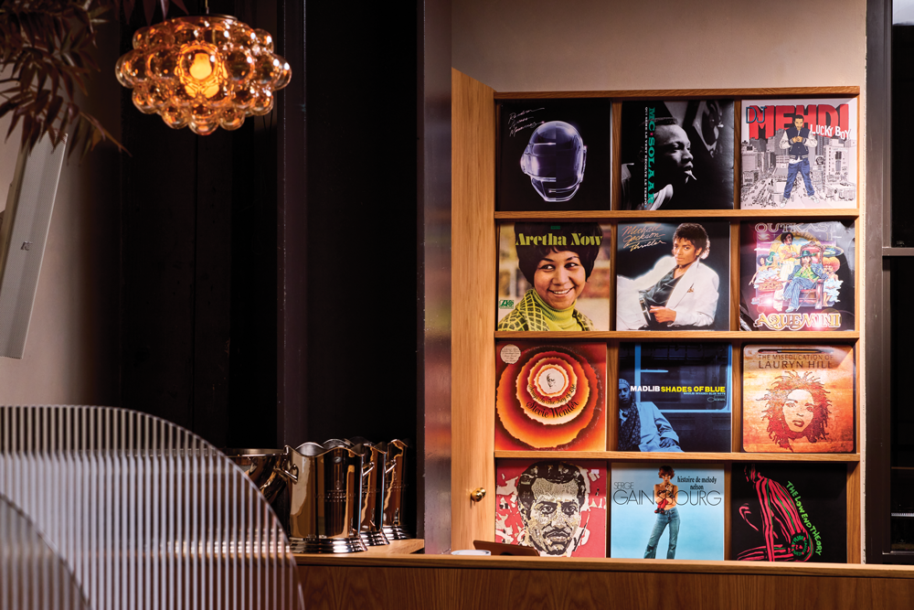
At the entrance is a hostess stand on one side and a DJ booth on the other, both made of white oak with some plywood. The DJ booth is used to further animate livelier nights and private events. Behind it, vintage records are on display. Black and white films are projected onto the wall for an old-time feel and a semi-open kitchen in the back brings the theatrics of cooking to the bistro without overwhelming the dining experience, according to Terpeluk.


Image courtesy of Hardy Wilson
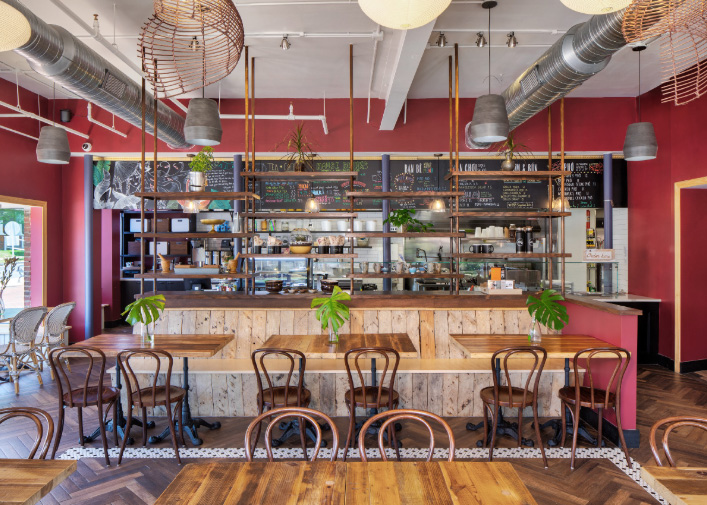
Bistro Du Jour
Washington, D.C.
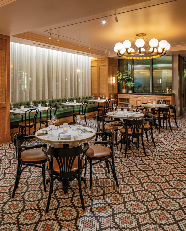
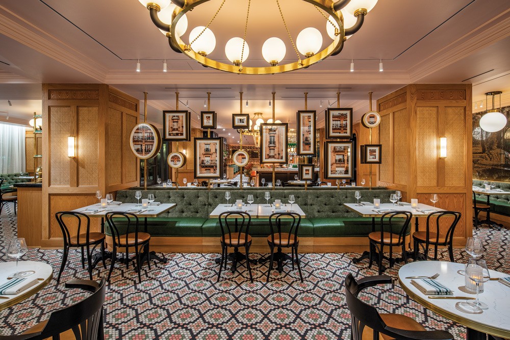
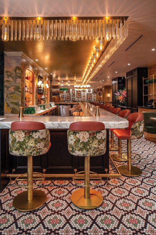
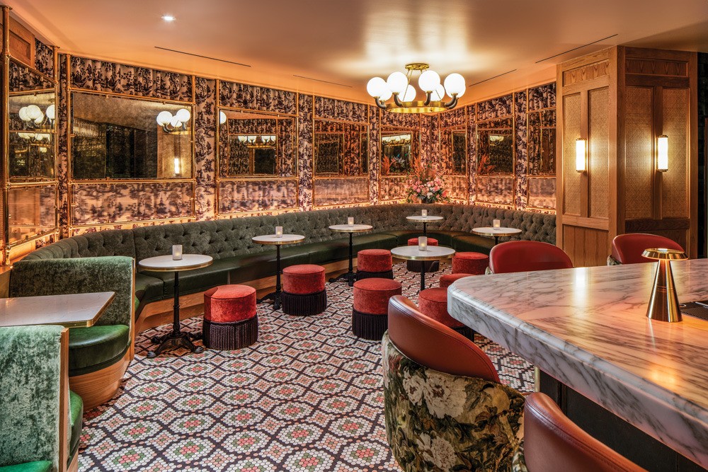
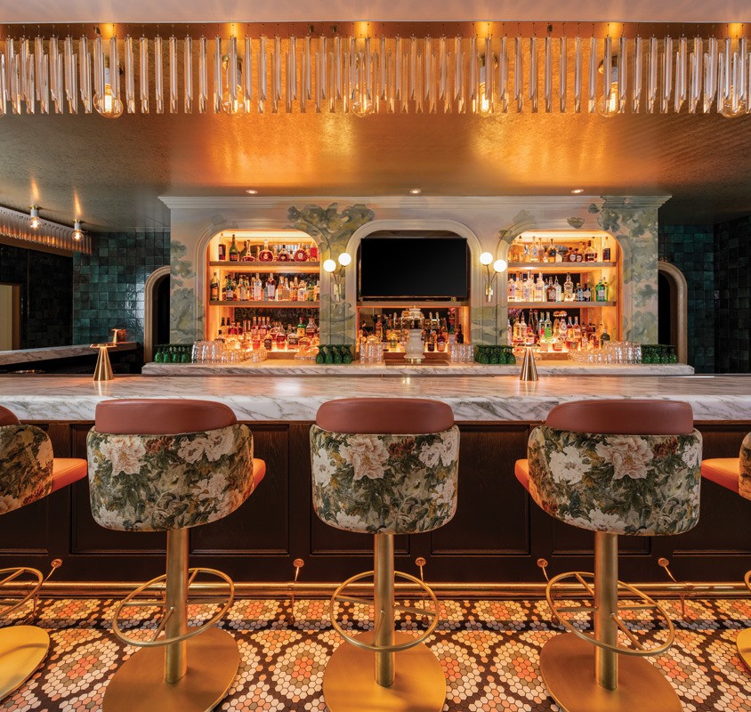
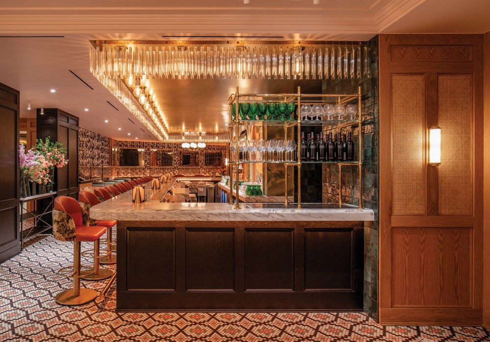
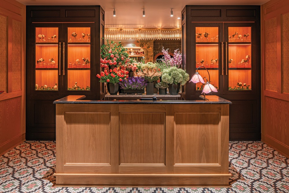
Bistro Du Jour in the Royal Sonesta hotel in Capitol Hill, is the second location of this small chain and “we wanted it to feel like the grown-up, older sister of the original restaurant,” says Meghan Scott, senior associate at Washington D.C.-based architecture and design firm //3877, who designed it along with KNEAD Hospitality.
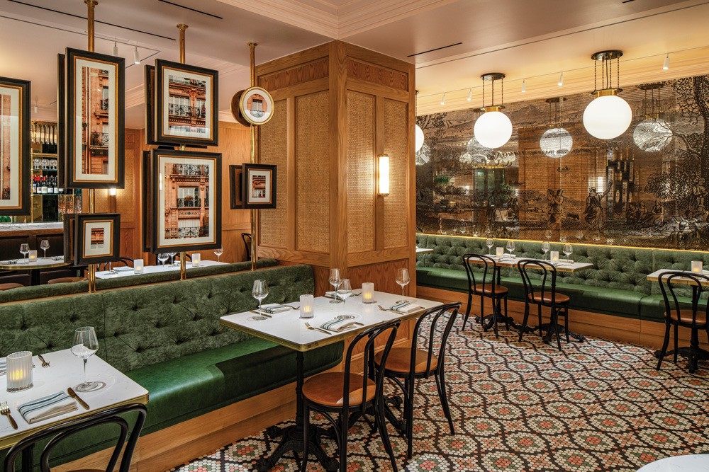
“We wanted to create an elevated experience and make it a little more refined.” She opted to keep the color palette of pinks, greens and creams from the first location, as well as the geometric floor tiles, the pine millwork and green velvet banquettes.
Scott wanted the space “to be warm, inviting and welcoming, and inspired by French flowers.” But she didn’t want it to be overwhelming so pulled in the colors of the flowers. She also wanted the wood-treated columns to pay homage to flower baskets, in another nod to the markets. These references, she says, gives you some feeling and warmth and the essence of the market without putting a sign up.”
Scott created a grand moment at the bar by installing a crystal valance above it, illuminated by socket-mounted pendants from behind. This, she says, “sparkles and has a petal essence, and has some movement but feels solid. It has a marquee feel, and it glimmers and glitters.”
The bar’s focus is on comfort, to be where customers would linger. The counter’s made of Taj Mahal stone, which is solid and feels “like a place you would be comfortable sitting and hanging out,” says Scott.
The back bar was inspired by French ranges and is comprised of framed drywall arches with millwork shelving. Two arches are filled with bottle displays, and the central one includes a TV. “We paid a lot of attention to the back bar and the lower portion of the back bar because it’s so visible from everywhere in the restaurant,” says Scott.
Around the back bar arches Scott commissioned a muralist to paint a French countryside, to provide a “peaceful reference of where the flowers come from,” she says. “We wanted it to feel like a painting that had been there for a long time and deliberately stayed away from Eiffel Tower references.”
Bistro Du Jour spans 6,000 square feet and has 200 seats. A gallery wall takes center stage that consists of framed images designed into brass poles to break up the space. Each double-sided image is cut from one single image of a French residential building, and viewers can fill in the gaps between them.
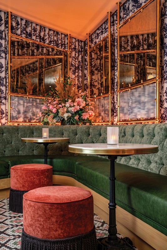
One wall of the bistro features an antique mirror, and Scott gave it the feel of mirrored jewelry boxes and etching that’s often on French wardrobes. The etching is a custom film, which is easy to clean, affordable, and can be changed out if needed. “It’s that additional layer of interest,” she points out.
Scott’s lighting goal was that every diner would feel they look great in this space so all lights have settings to change at different points in the day. She painted the ceiling light pink, “which reflects the light up and creates this soft blushy tone over your face,” she says.


Images courtesy of Joseph D. Tran
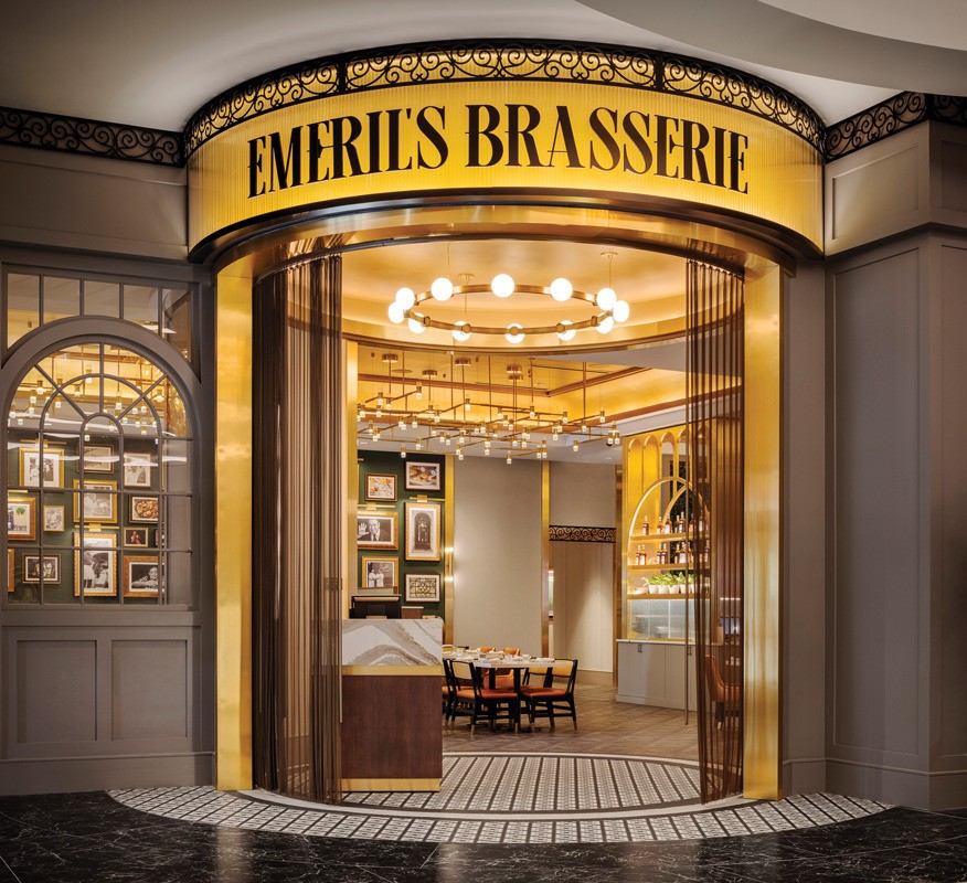
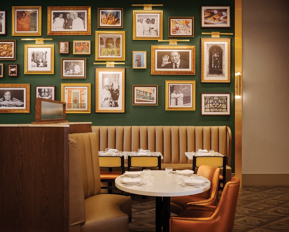
Emeril’s Brasserie
New Orleans
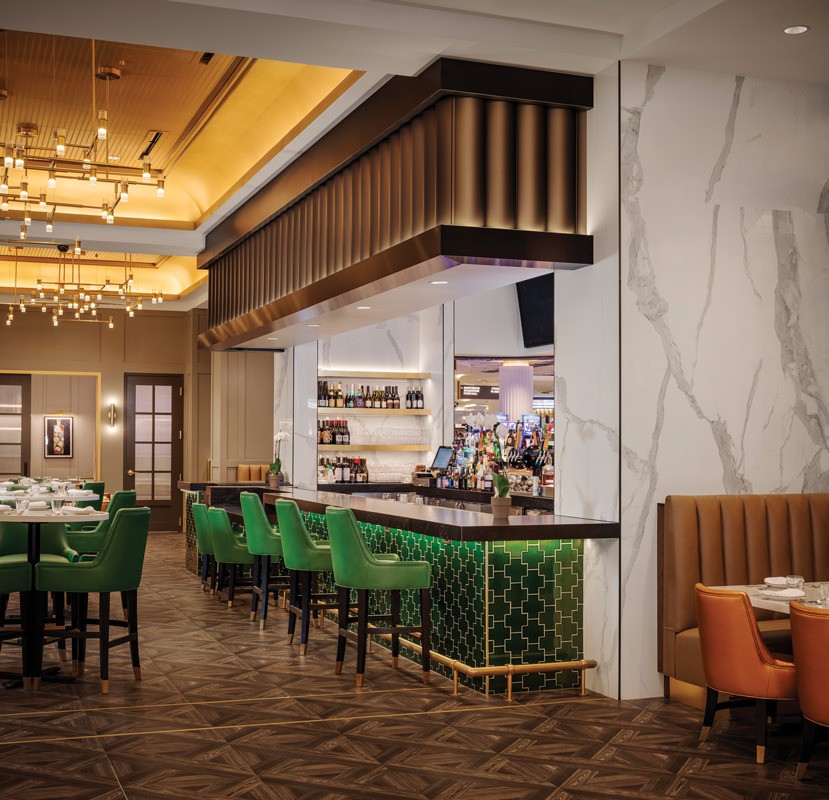
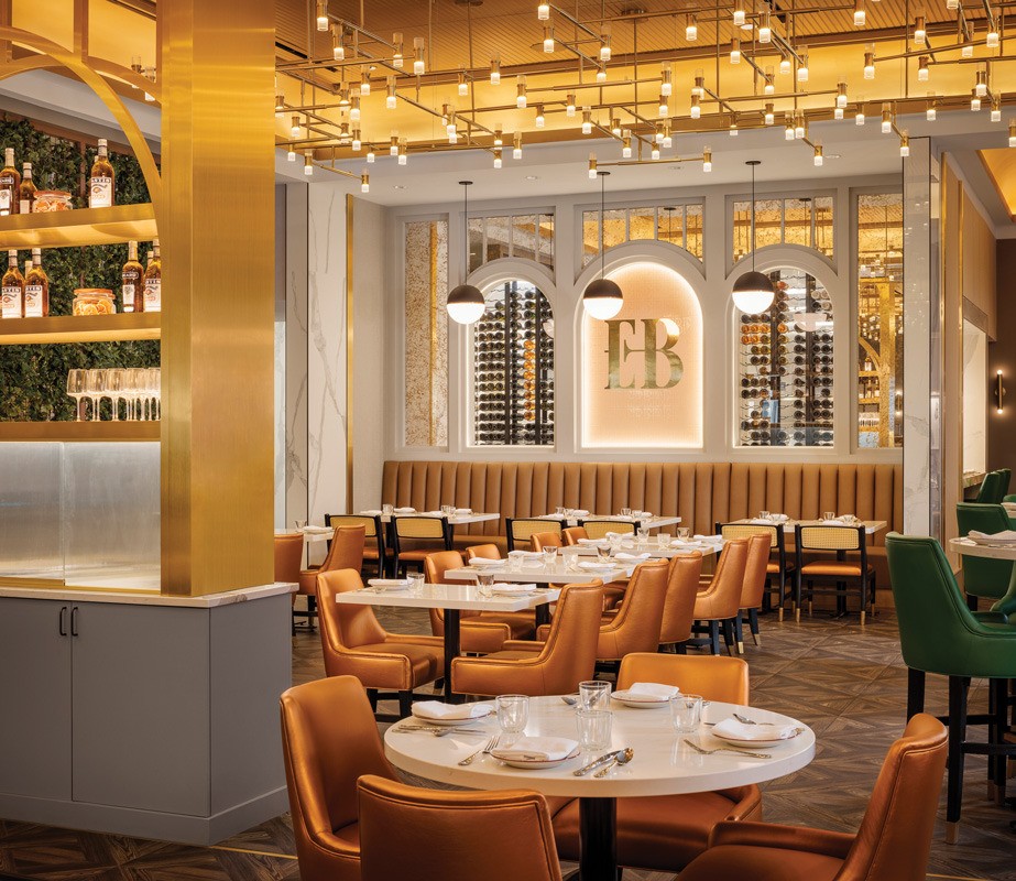
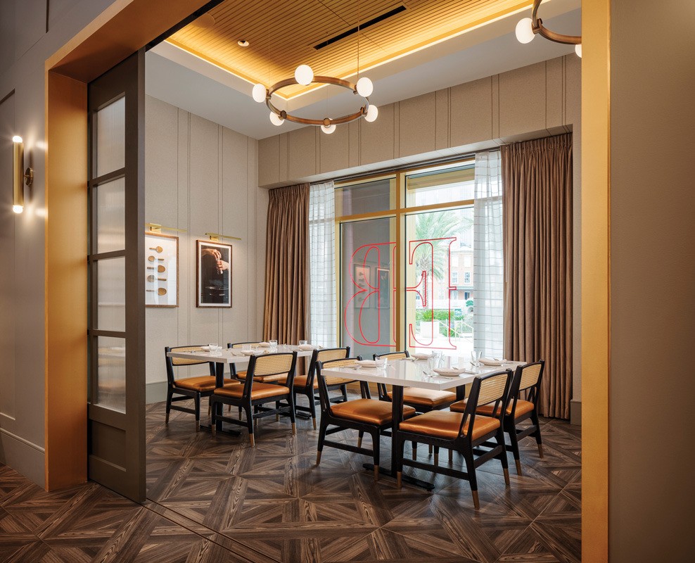
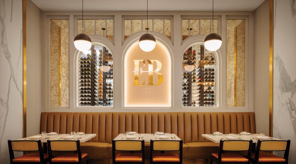
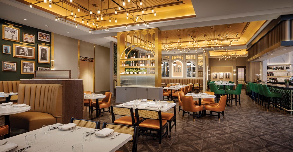
Emeril’s Brasserie in the Caesar’s New Orleans casino has an upscale vibe. The goal was to strike a balance between New Orleans style and a French setting.
Since Emeril Lagasse got his start in New Orleans, he wanted the brasserie to have some personal design features, which include a gallery wall of photographs and a signed chef’s coat over the host stand.
An elaborate gold entrance rotunda welcomes guests from the casino, surrounded by a mosaic floor. “A staple of authentic Parisian cafes, the black and white mosaic tile provided a touch of contrast to the warm palette of greens, brass, and wood,” says JoyceLynn Lagula, associate principal and studio leader, JCJ Architecture, Las Vegas.
The 9,000-square-foot, 250-seat space could have been cavernous, but Lagula broke it up with low walls, and a decorative server POS station that reaches to the ceiling and contains bottles and plants within one of the restaurant’s signature arches.
Lagula paid a lot of attention to the lighting and instead of having any standout pieces, chose instead to have dispersed twinkling lights across the whole space, “to make it feel not ostentatious.” The lighting was designed to give a French bistro feel of geometry “so it gives a little familiarity to people and fits the concept without overdoing it.”
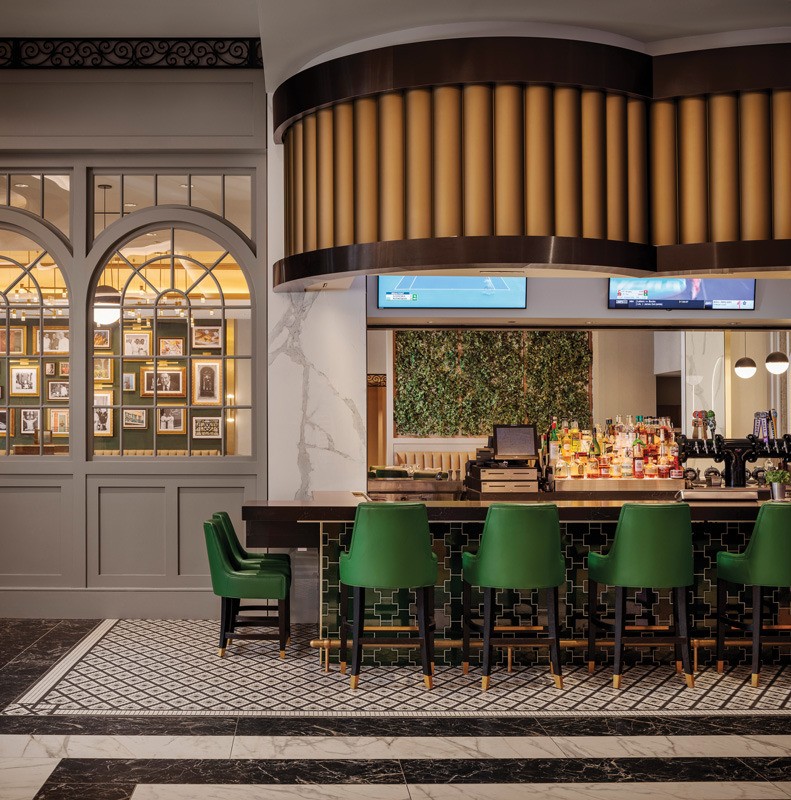
The bistro’s bar is double-sided. One side faces into the restaurant and the other into the casino, so guests can approach from either direction. This creates a “transitional” space, says Lagula. The bar front is green tile with lights under the bar top bringing more attention to them, yet the floor around it is different on each side. On the casino side it’s another mosaic; while inside there’s a parquet floor. “It’s a play on where we choose to put the bistro touches,” Lagula points out.
Above the bar is a fluted soffit, whose goal was to give the restaurant a characteristic from the casino floor. “We wanted something that really stands out,” says Lagula. “This one is more of an exaggeration of what we’re seeing in the casino — so the columns that you see in the gaming floor are these fluted elements." On the inside portion of the bar, the soffit is less elaborate because Lagula “didn’t want it to compete with everything else happening on the inside of the restaurant.”
Just outside the kitchen is a feature moment, with temperature-controlled wine storage behind a banquette. The wine storage is featured in two arches, while a third features the EB logo etched onto glass. Guests can see through the wine wall into the kitchen and feel part of that activity. Surrounding the arches is a custom gold wallcovering that, together with three pendant lights provide, “a different intimacy level,” says Lagula.


Images courtesy of Chipper Hatter

