Papa Johns has more than 5,500 restaurants in the U.S. and abroad in 45 different countries as diverse as Guam, Pakistan and South Korea.
The Atlanta, Ga.-based brand recently created two new prototypes — one for the domestic market and one for foreign locations — both designed differently.
This is to ensure they appeal to the local demographics, are as effective as possible, and don't offend anyone's sensibilities, says Jennifer Pecoraro-Striepling, vice president of design, construction, facilities and franchising. Here she shares seven best practices with rd+d about designing both prototypes.
1. Keep some things the same
And as part of its redesign, Papa Johns updated its name, dropping an apostrophe. "We took out the possessive, which is focused on one person," says Pecoraro-Striepling. "We're a team executing the brand component." This is now reflected in all stores.
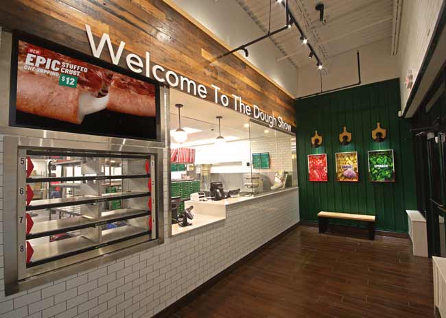
And the concept added a new catchphrase, Welcome to the Dough Show, which was the only element that was carried through to both designs.
Both new prototypes highlight the kitchens, which wasn't the case previously. "We want customers at both designs to see everything we're doing," Pecoraro-Striepling says.
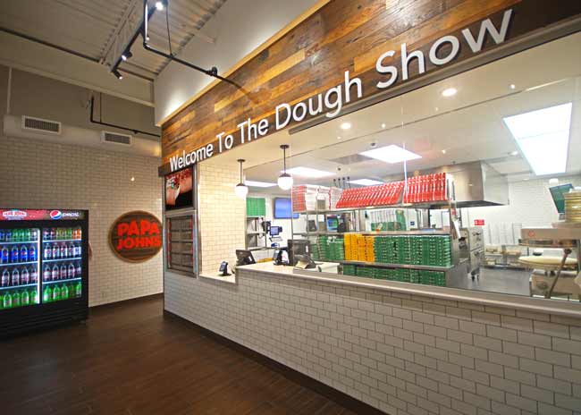 Customers are greeted with a sign that reads, "Welcome to the Dough Show." Images courtesy of Papa Johns.
2. Make international stores more subtle
The level of expectation in international stores is higher because a lot of business is dine-in, vs. the U.S., where it's almost all to-go, Pecoraro-Striepling points out. In the U.S., guests are in the store for five to seven minutes; internationally it's 30 to 60 minutes, "so the intention is to be more subtle abroad," she says.
A major goal of the new prototype is to emphasize the freshness of Papa Johns food but it was important to communicate this differently in U.S. stores versus international locations.
When customers enter domestic Papa Johns restaurants the Welcome to the Dough Show sign is directly in front of them, above the kitchen, in white puffy letters, backlit. In international locations the signage is red, purple and green, the brand's signature colors, so it's a bit more subtle.
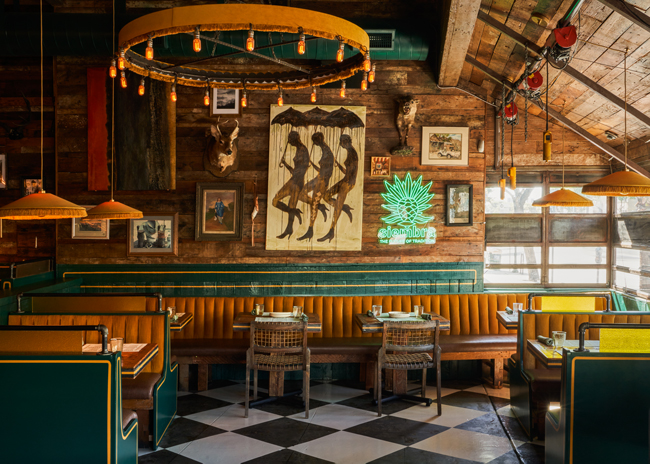
Other subtle touches in foreign stores include a wall showing cylinders that represent the stretching of the dough; and there's artwork showing images such as a hand sprinkling cheese. "We want that elevated, crafted look that focuses on the freshness," says Pecoraro-Striepling.
3. Design in the freshness
With both new prototypes, Papa Johns wanted to focus on freshness but it changed it up for different markets.
In domestic locations it's communicated through the color palate —warm greens and reds, which are also mirrored in the concept's logo.
In American Papa Johns restaurants, green is featured inside, on a wooden decor wall. And hanging above that wall are tiny pizza peel lights. The wall also features photographs of typical pizza ingredients, along with a circular piece of art that looks like a pizza peel, with a wood tone featuring the Papa Johns logo.
This textured wall has pops of color and images showing ingredients "that emphasizes that our pizzas are made from scratch, "Pecoraro-Striepling says. Using wood for the wall also emphasizes that the food is natural.
The upscale feel in the international stores comes through red, white and green tile instead of wood. The wooden wall and logo weren't needed because internationally, that warmth comes from the wooden tables and chairs, and also from people eating within the restaurants, Pecoraro-Striepling says.
 With both new prototypes, Papa Johns wanted to focus on freshness but it changed it up for different markets.
4. Hire different design teams
The new prototypes were designed by different teams so each had a sense of ownership of the new prototype, says Pecoraro-Striepling. For the international design, Papa Johns opted for H2R design in Dubai. "We wanted a firm that understood the different markets. We didn't believe we could get that from a domestic design firm," she says. "You have to be there and understand that customer and what they're looking for. I don't want to offend anyone or use the wrong colors."
Each team was able to understand the different expectations of the market it was designing for. Expectations are lower in the U.S., for example, because almost all food is taken out, whereas dine-in business is stronger abroad.
5. Bring in something unique
The international stores feature a unique LED light fixture that's almost in a figure eight. It meanders through the store (on the ceiling) mirroring the design pizza makers make when they dip a ladle into sauce and spread it on the pizza crust.
"We wanted something catchy but also linked to freshness," says Pecoraro-Striepling. "This light draws your eye in subconsciously but it's also a fun nod to one of the motions we do."
These lights are not custom-made, says Pecoraro-Striepling. "We try not to do anything custom because we move so quickly and because of the global supply challenges. We also don't want to add costs for the franchisee."
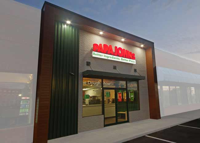 Papa Johns has lightened up the exterior of its stores in both the domestic and the international markets.
6. Exterior focus
Papa Johns has lightened up the exterior of its stores in both the domestic and the international markets. It's added more natural colors — red, white, green, to mirror pizza colors — and sometimes adds brick outside U.S. stores to emphasize the natural food. It's also replacing doors wherever it can with green doors "to differentiate ourselves and reflect the natural ingredients."
A lot of international locations are in malls, Pecoraro-Striepling says, so there's less opportunity to make an impact with the exterior. In these locations, Papa Johns focuses on making the logo stand out and subtle touches, such as with green panels. It also often uses video screens in foreign malls showing commercials or the action in the kitchen "to grab people's eyes," she points out.
The chain deliberately stayed away from too much red on its exterior and focused more on green, again to emphasize freshness but also "to separate ourselves and elevate ourselves from other QSRs. Red is the color of the QSR industry," Pecoraro-Striepling points out.