Tampa, Fla.-based Burger Monger was founded in 2010 by Jake Hickton, whose goal was to “build the best hamburger restaurant on the planet.” The concept, he says, is built around premium, steakhouse-quality Akaushi beef, and the high-quality breads and produce that would normally be found in a fine-dining restaurant.
Though Burger Monger has grown to five locations, when Hickton first started the company, he was working on a shoestring budget. As a result, “the interior design didn’t necessarily match up with the food.”
The company, then, recently rolled out a new design at its Wesley Chapel, Fla., location that better pairs the high-end steakhouse food with the burger joint experience.

This first redesigned restaurant occupies a space previously held by a Mexican concept. For years, the exterior of this Burger Monger location featured a Mexican restaurant-style reddish orange exterior, along with a red backlit sign.
The new exterior is a more stark, black and white, and is meant to evoke the feel of a place like Capital Grill or McCormick & Schmick's, says Hickton.
“We repainted the entire building white and added black awnings, which carry our new tagline, ‘Chophouse burgers and barstool shakes.’ We also have a more contemporary logo with just straight lettering. It’s stark and upscale at the same time.”
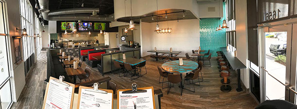
The restaurant’s interior carries the spirit of a steakhouse inside, with more blacks and whites, along with dark wood tones.
Since Burger Monger is a burger place, the designers introduced elements to liven up the space. Splashes of rich reds, yellows and teals — a play on traditional Florida colors — are sprinkled throughout and a variety of eye-catching light fixtures hang from the ceiling.
One burger joint element the design has less of, though, are television screens. Many have been removed to create a cleaner look while those that remain snub stress-inducing news channels in favor of sports and “MongerVision,” which plays eye-candy video clips (think extreme sports, magic tricks and epic fails), says Burger Monger CEO Randy Gier. While getting away from news channels was the right call, the chain is likely to add a few more screens to subsequent locations.“Some of the feedback we’ve gotten is we might have gone a little too far (on removing screens). I think fewer screens is ok, we just need them facing each direction.”
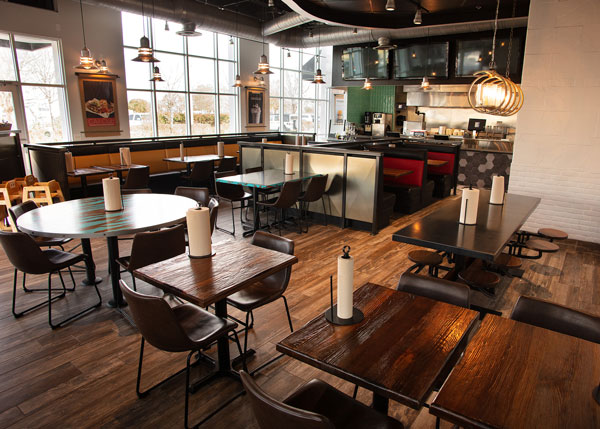
The redesigned restaurant offers a number of different seating options with the intent, says Hickton, to create zones that offer a sense of space and separation between guests. Seating choices including booths, bar seats, a banquette, floating two tops, a round table and a larger eight-seat picnic-style table with built-in swing-out seats.
This table in particular was a significant investment. Based on guest reaction, especially reactions from kids, it was worth the money, Gier says.
“You can’t afford everything in the restaurant to be a premium price but you can pick out a few things that can really stand out and make an impact. Don’t be afraid to spend a few more bucks to do that,” he says.
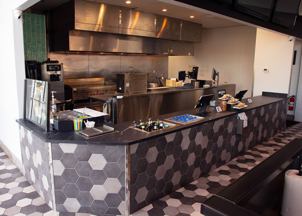
In addition to the dining, area, the chain’s open kitchen got a makeover as part of this project. An all new equipment lineup was specified and installed and pieces that were not stainless steel were clad in it for a clean, professional look. In addition, a section of teal subway tile was added to one end of the kitchen, where shakes are made. This touch is intended to invite customers to the area to watch the action.
“We want guests to feel like they’re part of the experience. People really like learning more about food. We wanted not just visibility to the kitchen but connectedness, where the guests feel like they can walk right up and see what’s going on,” says Gier.
 Images courtesy of Burger Monger
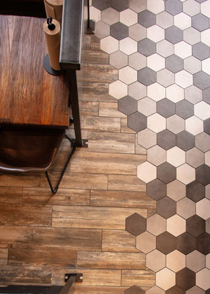
Another interesting use of tile is in the dining room, near the kitchen. The dining room has a wood-style tile that connects it to the steakhouse theme. At the kitchen area, though, it switches to a hexagonal tile. This touch, says Hickton, calls back to the foyers of older steakhouses while also adding a bit of visual flair to the space.
“It wasn’t any more expensive than any other tile you might use. We just bought some innovation to the design by mixing of the two types of tile,” Gier says.

