If there’s one cuisine that exemplifies fast casual, it’s Mexican. There’s Chipotle, Qdoba, Salsarita’s, Baja Fresh, Freebirds and at least half a dozen more solid options to choose from.
 With rust-colored Corten steel and southwestern colors in its new logo, Moe’s wants to establish its Untamed Southwest brand position from the start. All images courtesy of Moe’s Southwest GrillIf there’s one cuisine that exemplifies fast casual, it’s Mexican. There’s Chipotle, Qdoba, Salsarita’s, Baja Fresh, Freebirds and at least half a dozen more solid options to choose from.That’s great if you’re going out for a good burrito. But if you compete in the sector, it presents a big challenge. How do you stand out with all that competition?
That’s the question Bruce Schroder, president of Moe’s Southwest Grill, asked when he took the reigns of the brand nearly four years ago. “We need to make customer choices simple. The bottom line is you need to stay relevant to stay competitive in what’s become a share game,” he says.
To stay relevant, Moe’s decided a redesign and brand repositioning was in order. Developing this new design began with a research project. Wanting to learn the good and the bad of its brand, Moe’s went to the people that matter most — its customers.
Working with brand consulting and design firm Sterling Rice Group (SRG), the chain leveraged its loyalty program and Facebook group to identify three groups of customers: heavy users, light users and lapsed users.
“The heavy users could articulate what they love about the brand. The light users could articulate why they come now and then and what it would take to get them to come more often. The lapsed users could tell us what was it about the brand that turned them off and why they left. When you slice it and dice it that way, you get some really good feedback and direction,” says Schroder.
Getting the most from these groups took more than an email survey, though. Working with SRG, the chain conducted “ethnographic research,” where they interviewed guests and even held focus groups at Moe’s locations themselves.
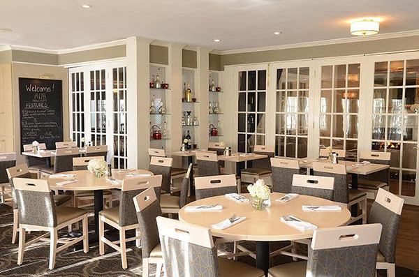
 Moe’s booths feature Native American-inspired upholstery and stylized tapestries as booth dividers.According to Jennifer Jones, managing partner with SRG, conducting field interviews can yield particularly rich information. “In this case we did interviews in restaurants with consumers, so they were immersed in the environment. That enabled us to get insights about Moe’s and what they really think about the experience, the food, the facility. Mining consumer insights is really important to what we are looking for. We want to know the emotional ties to the brand. What does it stand for in the hearts and minds of consumers?”
The research revealed three key areas of insight, says Schroder: about Moe’s brand, about the fast-casual sector in general and about the Mexican fast-casual segment in particular.
The first covers all the areas where Moe’s was and is hitting the mark, says Schroder. The chain has worked hard to create a vibrant, fun atmosphere in its restaurants, exemplified by the loud “Welcome to Moe’s!” greeting staff give to customers when they walk in the door. The chain’s research shows this greeting and the overall vibe matter to guests more than the chain had even hoped. Moe’s also found it did well with families who appreciate the friendliness but also the quality and variety of the menu.
The second insight, Schroder says, was that Moe’s doesn’t get enough credit for the freshness, variety and value it offers within the fast-casual space. One big example is the free chips and salsa that comes with every meal. Moe’s legacy practice was to simply toss these into guests’ bags with their orders, making the extra effort an afterthought for many customers.
The final lesson from the research was the most serious: Despite all the efforts of people who work in this space, there’s just not much difference between one concept and another in the eyes of the customer. While Schroder knew this was a challenge, it came through especially clear in the research. Some consumers, he says, simply won’t drive by a competitor to get to Moe’s.
Southwest Is Key
For Moe’s Southwest Grill, the solution to the challenges and opportunities revealed in its research was literally front and center. “Our middle name affords us the opportunity to [differentiate ourselves]. Tex-Mex is pretty broad, but Southwest is a unique aspect of that category that could set us apart. It has a fusion of a lot of different cultures: Native American, Mexican and the Cowboy West. That provides an interesting palette for culinary innovation and design,” says Schroder.
This opportunity has come to fruition in the form of a new prototype restaurant, dubbed Untamed Southwest. The first two stores were built in the second half of 2018. One, in Sandy Springs, Ga., is a remodel of a company-owned store. The second is a ground-up build in Kennesaw, Ga., owned by a franchise partner. This store, dubbed The Oasis, will also serve as Moe’s test kitchen for new menu items.
 Instead of marketing specials and LTOs, the Window to the Southwest video screen is designed to evoke the feeling of the region.
With Moe’s Southwest inspiration as its differentiator, the new design makes use of the looks of the region’s various cultures, along with its natural materials and feel, says Lance Reed, creative director with SRG.
“It’s really important to us that everything didn’t feel slick and polished,” he says. “In the Southwest things are touched by the elements. You think of the sunburnt wood and the oxidizing of metal when it rusts. There’s an almost windswept quality to things. They’re exposed to the hardness of the elements.” These elements can be seen starting with Moe’s new logo.
According to Jones, Moe’s previous logo — which featured a circular shape, red and yellow lettering and a chili-peppered-turned apostrophe — felt dated and also like it could fit into the QSR segment. The new logo is truer to the brand’s new emphasis. While it maintains the established equity of the strong all-caps name MOE’S found in the old mark, it now employs colors and shapes that evoke the Southwest. It features both diamond and triangle shapes to reflect the region’s landscape and rugged nature. And, instead of yellow and red, the colors are white, turquoise, orange and rust.
“We wanted to improve the idea of Southwest and really make sure that was coming forward with a more distinctive color palette, typography, patterns and references to the Southwest motifs and icons,” Jones says.
On the building’s exterior, the Southwest influence can be seen on more than just the logo. The new design features a tower clad in a rust-colored Corten steel with a strong patina. The tower’s base, meanwhile, is covered in a stone-style material.
 To get credit from customers for its free chips and salsa, the chain went from a staff-served to a self-serve model.These elements, in particular the steel, says Reed, help establish the brand personality. “Corten is an architectural mood they do a lot in the Southwest. We thought it would look really beautiful, and it helps to set Moe’s into a unique space where it doesn’t really feel like a Chipotle or Qdoba or something else. It feels like an authentic brand that can stand on its own.”
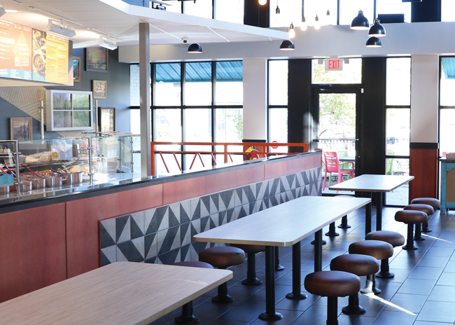
The exterior aesthetics carry through to the building’s interior, where the color palette includes neutral tones along with pops of Southwestern colors and textures such as rust-colored wall elements and Native American-inspired upholstery.
As guests enter, they encounter a video monitor designed to look like a window that showcases rotating, often lighthearted images of Southwestern scenes. The purpose of this feature is to help set the emotional tone; any branding in the videos is minimal.
“We are having to train people on what does the Southwest mean,” says Moe’s Director of Strategic Initiatives Sunny Ashman. “The guests absolutely love that element. They don’t feel like they’re looking at a typical presale board that you would see at a fast food place that’s constantly rotating LTOs.”
At the order line, guests encounter more Southwestern elements. The face of the order line is covered with a printed graphic that looks like a woven basket found in Native American cultures.
On the line itself many ingredients are served out of pots and pans instead of stainless-steel wells. Dine-in guests receive their orders in white melamine bowls instead of disposable packaging. These changes, says Schroder, make the food presentation less institutional and more of a chef’s kitchen, highlighting the quality of the chain’s food for the guest.
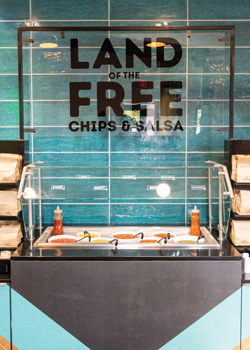
At the end of the line, instead of serving a bag of chips to every guest, Moe’s has created a self-serve station for chips and salsa. The chain communicates the value of this offering with a playful sign declaring Moe’s Land of the Free Chips and Salsa. In addition to highlighting for the guest an element that was already a differentiator, making chips self-serve has simplified life on the line. Staffers no longer have to deal with chip refill requests, and moving the chip warmer from behind the counter created a more efficient design, says Ashman.
Once guests have their food, they’re given several different seating options.
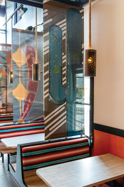
The restaurant’s booths have the clearest Southwest influence. The backs are upholstered with a fabric inspired by Native American culture while light fixtures with a sun motif hang overhead.
Even more explicitly Southwestern are the dividers between booths. Instead of using panels attached to the booths, Moe’s utilizes tapestries that hang from the ceiling. These pieces feature stylized characters like cacti and geckos that, says Reed, seem to have their own distinct identities.
“If a brand is all about individuality and diversity, we want to create all these different zones that have very distinctive characters…[The booths seating area is] a signature brand space where we could bring in more of the personality elements,” says Reed.
In addition to booths, the restaurant contains larger community tables. Stools at these tables are bolted down in order to keep the restaurant organized and to comply with ADA requirements. These spaces are especially popular with families, one of Moe’s key customer groups. The design also includes banquette seating and floating tables, allowing customers to select the seating arrangement that works for them.
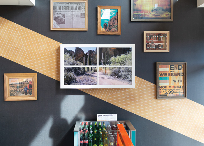
The new design also features a large Welcome to Moe’s mural as well as green neon cacti that can hang in windows, serving as a brand marker to those outside the restaurant as much as for those inside.
 The new interior features neutral tones along with Southwestern colors and textures, including turquoise, rust and orange.
Off Premise, On Budget
Another design element isn’t so much about brand personality as it is the shifting nature of the restaurant industry. With the rise of off-premise dining and third-party delivery, Moe’s created a dedicated pickup station for to-go orders, topped with a metal cactus sculpture.
This isn’t the only change Moe’s has made with off-premise dining in mind. Beginning before the launch of the redesign, the chain began experimenting with drive-thrus. Normally, drive-thru ordering is difficult for a concept that allows for so much customization.
According to Schroder, though, advances in touch-screen ordering make it easier for guests to create the exact meal they want, especially compared with trying to dictate an order via microphone to a staffer.
In addition, the chain has developed more chef-created offerings that can be highlighted on the touch screen.
“In addition to tasting good, obviously [ordering a chef-curated item] speeds up the line. It does eliminate some more challenging engagements between our guests and our workforce, too. It makes it easier on everybody,” Schroder says.
Of course, with the shift toward off-premise, there’s one other big change to Moe’s: The restaurant has fewer seats, going from 82 to 70. Ideally, new locations will go into smaller spaces than legacy Moe’s stores, Schroder says.
While smaller restaurants and the resulting cheaper rents will make franchisees happy, Moe’s has also changed up its approach to building new stores.
In partnership with SRG, Moe’s has created a kit of parts that allows franchisees to select different finishes and fixtures at different cost levels. Elements ranging from light fixtures to the Corten steel on the exterior can be subbed out if the project’s budget requires it.
Keeping franchisees happy is particularly important for Moe’s, given that the chain is almost entirely franchised. This growth strategy will continue as Moe’s carries on its expansion.
While the chain has established itself on the East Coast, some future growth will certainly come from new markets. Even when the competition is fierce in these spots, the chain’s new brand positioning and new look should let it stand out enough to succeed, says Schroder.
“I think the newer manifestations of the brand will be competitive enough to provide the reasons to have a new concept, even in places out west where we may be the 15th or 16th category concept to come to market,” Schroder says, “Now we’re different. We’re not just Tex-Mex, we’re Southwestern.”
Project Team
- Project lead: Sunny Ashman, Director of Strategic Initiatives, Moe’s
- Architect: GPD Group
- Kitchen supplier: TriMark Strategic
- Interior design: Conceptual design by Sterling Rice Group and Lauren Taliaferro, Director of Design for Moe’s
- Kitchen design: Collaboration of Lauren Taliaferro, Director of Design for Moe’s, and Karen Bustios, Director of Operations for Moe’s
Snapshot
- Concept owner: Moe’s Southwest Grill
- Headquarters: Atlanta
- Location of new prototype: Kennesaw, Ga.
- Real estate: Strip center, end cap
- Concept: Brand repositioning and prototype design
- Segment: Fast casual
- Size: 2,600 square feet
- Unit count: 721
- Opened: November 2018
- Design highlights: Brand hallmark signage of Welcome to Moe’s!; Vibrant colors and materials that reflect the effects of the harsh environment in the Southwest region of the U.S.; the Window to the Southwest video storytelling hallmark, new lighting and community tables.
- Build-out time: 90 days
Floor Plan
Click on image for more detail.