After an exhaustive search for the perfect location, a food truck business in Rochester, N.Y., now known as Petit Poutinerie, opened its first brick-and-mortar outlet in 2020.
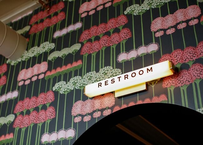 A lighted sconce is a highly effective way of keeping signage small while still being readily noticeable. Images courtesy of Matt Wittmeyer.
Established in 2011, Petit Poutinerie had pioneered the food truck movement in the Rochester area and had built a loyal following for its signature French fries covered in cheese and gravy. The owners sought an inviting atmosphere for sit-down dining, but because they opened during the Covid pandemic, to-go service had to be a key part of the business strategy.
It was critical for the new restaurant’s design to make it quick and easy for customers to locate the in-store order pickup area. Taking inspiration from the business’s food truck roots, the pickup station sports an awning emulating the covering over the food truck order window. This innovative feature, along with signage, highlight the to-go station and illustrate how to combine wayfinding elements to support efficient, orderly service.
Numerous features can be used to point the way to key areas such as order pickup, host stations and restrooms. Some elements, such as digital signs, can be big and bold, while others, such as flooring and millwork, are subtle. For best results, it’s important that wayfinding elements clearly support their intended purpose and are in sync with your branding.
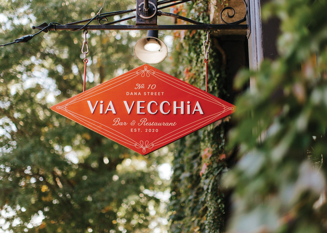 Spotlighting makes a small sign like this one stand out after dark and in shadows. Image of Via Vecchia sign courtey of Jamie Mercurio
“The worst thing is having people milling around wondering where they should be going,” says Sean Wilkinson, principal and creative director, Might & Main, a branding and graphic design firm with clients in the hospitality and restaurant industries. That undesired outcome often stems from not making signs “large, legible, and intentional enough,” he says. If people don’t notice signs, they are not doing much good.
This can be especially irksome at a sprawling resort or inside a food hall where a large space is chock-full of visual stimuli. Signs need to be large enough to be noticeable but not so large that they overwhelm the space. The appropriate size is a judgment call depending on factors such as ceiling height and counter width. Generally speaking, larger spaces support larger dimensioned signage.
 Right: Embossed metal as a sign medium is particularly suitable for high-end establishments.Consider a sign within a frame of a patron’s point of view. What elements close to the sign will draw a person’s attention? If it is a visually busy space, a sign might have to be sized bigger to capture attention. Also consider where a sign will be most noticeable. Signs can be affixed to walls, hung from ceilings, placed on a countertop, or stuck to the floor like those ubiquitous spacing stickers used during the pandemic, though the latter can get lost in heavy foot traffic.
The font and colors of a sign’s typography are also critical to noticeability and legibility. Sharp contrast between typography and background is crucial. For example, a common option of black lettering on a white background is readable from a long distance, though many colors can be used if they are distinct from the background shade.
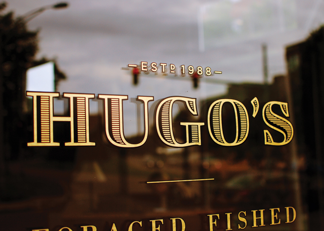
Numerous materials are appropriate media for signs including vinyl appliques, plastic resin formed by CNC machines, embossed glass and metal, blackboards and cardboard. Printed vinyl graphics that can be applied to a variety of substrates are an increasingly popular choice, says Jason Longo, owner, Jason Longo Interior Design, designer behind Petit Poutinerie. This material provides a versatile medium that can imprint images and logos in many sizes, shapes and colors as well as a broad array of type styles. Many local printing companies are equipped to produce these graphics at a reasonable cost.
 Left: Creative signs like this one convey a distinctive brand image. Image courtesy of Sean WilkinsonPlastic resin is another versatile material that readily lends itself to logo imprinting and multicolored typography. Many local suppliers can customize signage from this material. Media such as carved wood, embossed glass or metal are more limited in the types of images they can support, but they can convey a classier, more upscale ambience. Indeed, a carved sign by a skilled craftsman bolsters a brand in a setting like a classic Irish pub where a bright plastic sign could be dissonant with the decor.
In recent years, vinyl sign technology has advanced to create effects emulating gold, silver and brass leaf, Wilkinson observes. This might not quite match the effect of genuine metal leaf, but it can create a reasonable approximation on a budget. For a luxury brand, an embossed solid metal sign can support a high-class ambience. Wilkinson used this option to identify the elevator button for the floor of a restaurant at Manhattan’s elegant Saks 5th Avenue retail location. To make a sign in any of these media stand out, you can add spot lighting to highlight it.
Lighted sconces can form a sign that is easily readable even if modestly sized. Longo used this option to highlight the take-out station and restroom at Petit Poutinerie. Tinted glass or plastic can be used for these features, but glass is not a good choice if it is within reach of staff and customers. For example, if a glass sconce is perched on a counter, there’s a good chance it will get knocked over sooner or later, sending sharp shards in all directions.
Signs are the most prominent wayfinding elements, but more subtle features can also be effective in catching customers’ attention, distinguishing different areas from one another, and guiding people along paths. For example, in some restaurants the flooring changes from carpeting or wood in the front of the house to tile in the back of the house. Tile installed in the back of the main dining area provides a subliminal clue that can help patrons find restrooms, as many public spaces have used this strategy for many years. In busy, heavily trafficked establishments such as food halls, contrasting flooring material laid out in a linear form can help designate pathways, distinguishing them from ordering and dining areas.
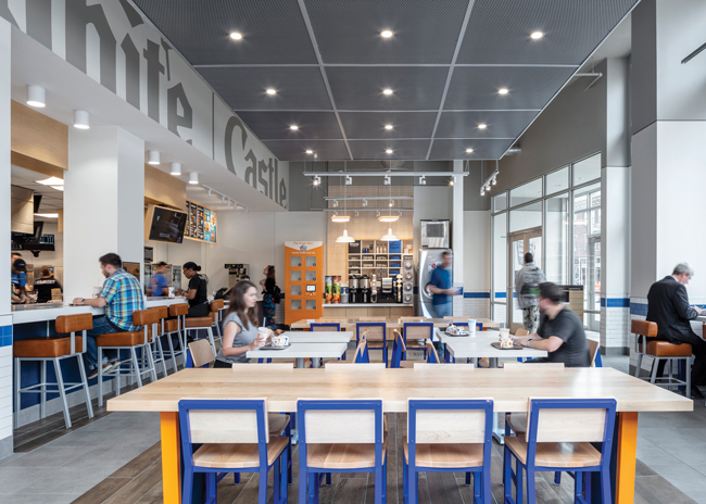 This White Castle in Columbus, Ohio, has an orange mobile order pickup locker next to the POS station. This feature’s function is obvious and acts as a wayfinding element. Image courtesy of Magda Biernat Photography
POS stations on countertops act as beacons signaling customers where to go to place orders. Even though wayfinding is not their primary function, they perform the wayfinding role as customers are conditioned to associate the equipment with their purpose. Order pickup features, such as shelving and cubbies that hold prepaid orders for customer pickup that became common during the pandemic, perform a similar function. Positioned within site of the entrance, these elements provide wayfinding even without accompanying signage.
A couple of visually dynamic, electronic options are useful for wayfinding. Digital screens, often used for menu boards, are homing beacons for order taking. There’s no need for an “order here” sign when these are placed behind a counter. LED strip lighting, available in many different colors, is a more subtle way to attract attention to an important area of the restaurant. Longo framed the pickup area at Petit Poutinerie with this energy-efficient lighting feature of pink lights that flash on and off creating the illusion of movement. Combined with the overhead awning, the result is an eye-catching area that instantly captures visitors’ attention.
Signs, graphics, and wayfinding cues should be considered holistically within the context of all branding elements, designers emphasize. “Signage is an opportunity to reinforce a visual brand,” Wilkinson says. That means all signs and wayfinding elements should be considered when other branding elements are planned during the design stage. “Include them when you are choosing furniture, fixtures, and other design elements so that they feel that they are an integrated part of the whole experience,” says Peter Stocker, principal with the design firm MG2.
 Below: Embossed glass is both sophisticated and implies permanence. Image courtesy of Matt Wittmeyer
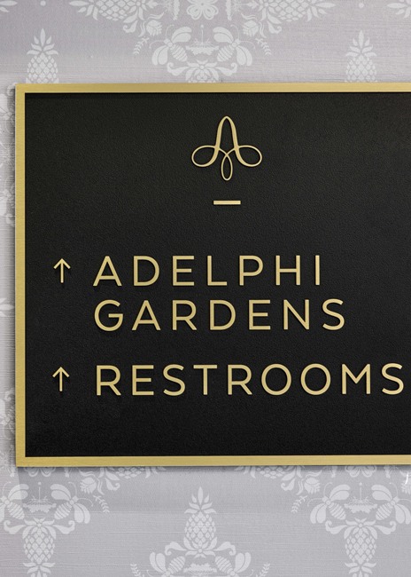
Don’t overlook this aspect of design even on something as simple and utilitarian as a restroom sign. A cheap-looking restroom sign in an elegant fine-dining setting can be visually dissonant and off-putting, for instance. “If I’m paying hundreds for a meal, I don’t want to see a generic office sign or restroom sign on a door,” Wilkinson says. “It makes you feel like there is something a little off.”
Stocker advises against placing signs that point the way to restrooms because these detract from the overall restaurant environment. Prominent wayfinding to restrooms is associated with places like large malls and airports, not more intimate dining settings, he says. “Architecture plays a role in restroom wayfinding,” Stocker points out. “People tend to look for restrooms adjacent to the kitchen, so if that’s where your bathroom is there is really no need for a sign.”
With outdoor dining exploding in popularity during the pandemic, new wayfinding issues have come to the fore. During a recent trip to New York City, Stocker noted that some restaurants had set up enclosed cabanas for sidewalk dining. These elements blocked views of the restaurant sign over the main entrance, he discovered. To compensate for that effect, place signs on the cabanas or put freestanding signs in between them so passersby can identify your establishment.
 Embossed glass is a classy looking option for signage. This medium typically is not subject to historical district regulations. Image courtesy of Matt Wittmeyer
When arriving at some restaurants with street or sidewalk dining areas, patrons might be confused about where to go for a table assignment if there is no attended podium or host station in sight. In such cases, a simple sign indicating that customers should go inside to meet the host could be a good solution.
When choosing signs for any wayfinding purpose, keep in mind that all signage is an opportunity to reinforce a visual brand and that maintaining continuity among visual elements is important. Sometimes, Wilkinson says, new restaurateurs opt for DYI signs. That can be ok, but as you open new sites, it becomes more important to have consistency, he says. Signs at one location should look the same as they do at another location so that patrons instantly identify the brand.
Whatever media and strategies you use for wayfinding, get an unbiased opinion from an outside source to evaluate their effectiveness, especially if you do not hire a branding specialist. “Look to a friend, someone who is not in the space every day,” Wilkinson advises. “Don’t just trust your own eyeballs.”
Get their opinion on how easily they can identify key areas in the restaurant and find their way around. If the response is positive, you can have more confidence that your wayfinding elements are working. If not, you probably need to make your wayfinding more eye catching and clearer.