When news leaked that the Italian restaurant next to Lola, the flagship restaurant of Michael Symon Restaurants (MSR) in Cleveland, might be going up for sale, Symon and his team got busy.
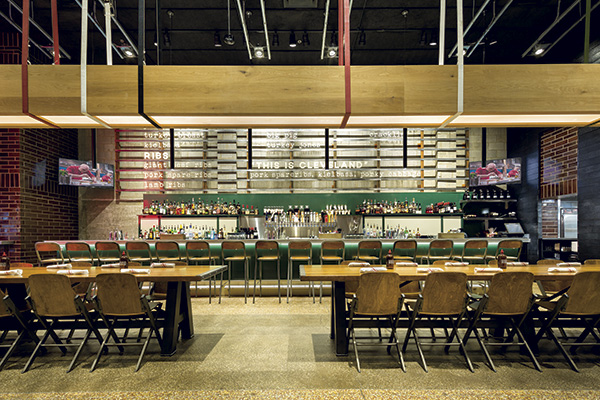 Two large, 16-seat wood-topped communal tables are centerpieces on the main level. Lighting is suspended from the ceiling on colorful, industrial nylon straps. Photos courtesy of Mark Steele PhotographyThey were already in expansion mode with a multiunit better-burger concept, B Spot, and figured that the Italian restaurant could be a relatively quick and easy conversion. They secured the lease and added the location to the queue of three additional B Spots that were already under construction.
But something about it wasn’t clicking for Symon, a hometown hero who had cooked his way to international fame as a Food Network Iron Chef and who also now co-hosts ABC’s “The Chew.”
“We were all set to go in with a B Spot and, as the dollars-and-cents-guy on the team, I was all for it. It worked,” says Doug Petkovic, business partner of Symon and his wife, Liz, in MSR. “But Michael got us thinking about doing another one-off concept instead — something creative, unique and interesting; something that Cleveland was lacking. That something was barbecue.”
 Originally a Woolworth’s dime store, the building’s exterior was left largely untouched. Signage features simple messaging and retro styling that highlights food, liquor and barbecue.Fast-forward an extra year and more than $1 million beyond what was originally budgeted to convert the location to a B Spot, and meet Mabel’s BBQ, MSR’s sizzling-hot, urban backyard barbecue joint. Operating at capacity — and then some — since the day it opened in early May, Mabel’s serves up pit-smoked barbecue in a full-service, design-forward environment that’s modern and industrial but at the same time playfully nostalgic.
Mabel’s is also a love letter to Cleveland. “This isn’t Texas Roadhouse. The whole design concept is that we wanted the space to exude and celebrate Cleveland heritage. Its roots are very Midwest, industrial, working class, eastern European,” Petkovic says. “It’s a Cleveland original and in many ways a throwback to the kind of big, open, relaxed backyard cookouts that have always been such a part of the culture here.”
Working with Cleveland-based Richardson Design, Liz Symon, who leads MSR’s front-of-house design efforts, and the team set out to transform the space into their vision for Mabel’s. As locations go, it’s a gem: East 4th Street in the city’s burgeoning downtown district is a stone’s throw from the Quicken Loans Arena, home to the NBA champion Cleveland Cavaliers, and Progressive Field, where the Cleveland Indians play. The street, much of which has been redeveloped in recent years, is now home to multiple bars, restaurants and entertainment venues.
As buildings go, however, it was a bit of a challenge. Originally a Woolworth’s dime store and later the ground floor of a parking garage, “it’s kind of a concrete bunker,” says Scott Richardson, owner and principal designer at Richardson Design. “It had previously been converted to a restaurant. The venting and ductwork were in place, but we ended up gutting the space. The only things left in place were the existing kitchen’s hood, the original terrazzo floors and the concrete block walls.”
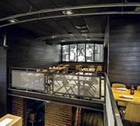
 In the mezzanine, lighting provides design panache and subtly speaks to Symon’s love of motorcycles by mimicking a series of headlights on the longest concrete block wall.Measuring roughly 3,000 square feet on the main level, the restaurant included a wraparound mezzanine, under which the original bar sat. “Had we done a B Spot, we could have left the bar there and saved a lot of money. We tried to, but it just wasn’t working for Mabel’s,” Richardson says.
Ultimately, the bar was flipped to the opposite side of the space. “Convincing the team that we had to do that was one of the biggest challenges,” Richardson says. “The original bar under the mezzanine was cozy but felt compressed. We knew the bar was going to be a focal point of the activity and wanted to open it up. Even though we had to reroute a lot of the plumbing and electrical, moving the bar made all the difference in the world.”
Making Magic Upstairs
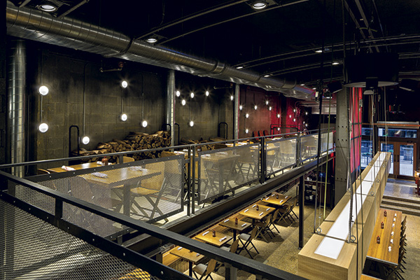
 The mezzanine was expanded to allow for more seating. A mural on one wall, behind which sit two large smokers and a prep kitchen, anchors the space with a photo of Chef Symon as a child at a family barbecue.The mezzanine also required significant modification. Originally more of a catwalk, it was too narrow to hold more than a few two-tops. The volume that Mabel’s would need to do to generate sufficient ROI required additional seating. With no chance of expanding downstairs, the only place to expand was upstairs.
“When you factor in the kitchen, storage, restrooms, etc., we couldn’t get enough seats in it to make the numbers work,” Petkovic says. “So we ended up expanding the mezzanine. That added significantly to the time and cost because we basically had to rebuild it, making it about three feet wider.”
Beyond providing extra seating, the expanded 1,500-square-foot mezzanine ended up being critical to the project in another way. As part of its reconstruction, one section was walled off to serve as a second kitchen — specifically, to house Mabel’s two large smokers and a prep area — where the magic happens, according to Petkovic.
“Being an urban location, and because of the physical confines of the space, accommodating the smokers took some creative thinking,” Richardson says. “Upstairs ended up being the best solution, so when we expanded the mezzanine, we created a walled-off section to house the smokers. Operationally, we worried it would be a bit of a challenge, with the main kitchen on the first level, but it has worked out really well. Everything is smoked upstairs and then transported downstairs for finishing and plating.”
The team took pains to make the mezzanine space feel special. Design highlights there include a black-and-white photo mural on one wall that sets the scene and anchors the space. The photo shows Chef Symon as a kid in a baseball cap with his parents, sister and grandparents at a barbecue in the family’s backyard.
Along another long wall in the mezzanine, lighting provides design panache. “It’s a big, expansive wall, and we wanted to create something a little unique up there,” Richardson says. “Michael is a big motorcycle guy, and we wanted to speak to his personality, so the wall lights in that area subtly mimic headlights arranged in an interesting pattern down the wall. Because the wall is concrete block, we had to do everything surface mounted, so we decided to make it a bit of an art statement. It’s both functional and aesthetic — as are the stacks of wood for the smokers up there.”
Design Highlights Elevate, Localize
 Wood and metal folding chairs were custom fabricated to emulate the type commonly pulled out at church suppers or union hall meetings, while large communal tables, designed to evoke picnic tables, help set the “backyard barbecue” stage.While the barbecue genre gravitates toward thematic designs — or little design at all — that’s not what the MSR team was after with Mabel’s. But while it would be new and noteworthy, they didn’t want it to feel that way.
“To me, the real success of Mabel’s is this new, slightly funky design that still manages to have an old, iconic feel to it,” Petcovik says. “It really does feel like a backyard barbecue in a new era, which is exactly what we were after. It seems every place you go for really great barbecue, whether in St. Louis, Kansas City or Texas, they’re all pretty down and dirty — but in a good way. We wanted to bring that simple style of barbecue but still give people a level of hospitality, ambiance and service without making them feel like, ‘Wow, this is too nice.’ So those were the marching orders to the designers: Keep it a down-and-dirty barbecue joint, but at the same time create an elevated experience for guests, who might be paying $20 a plate.”
For initial local inspiration, the Richardson team took design cues, like glazed brick and metal trusses, from Cleveland’s iconic West Side Market, where Chef Symon shopped as a kid with his family. Starting with the building’s stripped-down, rough and rustic shell, they layered in subtle, playful design elements that both elevate and entertain.
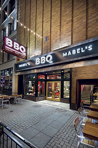
That approach starts on the exterior with the black sign band that’s original to the old Woolworth’s building. It was pulled down, repaired and painted. Signage on the front of the building was kept simple overall, highlighting the offerings — food, liquor, BBQ — more prominently than the name of the restaurant.
The restaurant’s entry, flanked by a small patio seating area, welcomes guests with a two-story, neon red Eat More Meat sign, a trademark phrase of Chef Symon’s.
“We had it designed by a local artist, and we love it because it does several things,” Richardson says. “It makes a huge statement when you walk in the door. You know instantly that you’re in a Michael Symon restaurant. It also creates a glowing feeling, almost like embers, that reflects in the glazed brick at the host stand and at night spills out of the storefront. It’s a nice, warm glow that might be coming out of a barbecue pit or steel mill.”
Inside, the “black-smoked” ceiling and concrete walls, glazed brick, steel, leather, and natural and charred wood set the tone for MSR’s take on the modern backyard barbecue. “We made the interior feel a little like you’re in a barbecue pit,” Richardson says. “Even though the main walls are just concrete block, we sort of smoked them so it feels like the ceiling was enveloped with smoke at one time and began to come down the walls.”
The host desk resembles the kind of garage workbench that’s commonly pulled out to serve as a table for food at neighborhood gatherings. Steel-framed wood doors on the wall behind it are clad in leather belts.
Having moved the bar, the design team made it a focal point. It’s meant to emulate the type of midcentury steel Coleman cooler that always was — and still is — part of Midwest backyard barbecues. Behind it, a large, steel-framed board with custom lettering that was inspired by old gas station signs highlights key menu offerings. The lettering, done on frosted acrylic panels, can be changed out as needed using long poles.
Chairs were custom fabricated to emulate the wood and metal folding chairs pulled out for local church suppers and union hall meetings. And two large, 16-seat wood-topped communal tables are centerpieces on the main level. Inspired by picnic tables, they were custom designed to have a cleaner, contemporary-industrial look. Above them hangs lighting fashioned from a massive wooden beam suspended from the ceiling by colorful, industrial nylon straps.
Of the overall design effect, Richardson says, “We didn’t want to be thematic, but we wanted to create a bunch of moments that might evoke memories of old-school backyard barbecues and cookouts. There are a lot of things woven in that you may or may not pick up on, but if you’re from Cleveland, you’re going to recognize many of them. Hopefully, they’ll make you feel right at home.”
Project Team
- Michael Symon Restaurants: Michael Symon, Liz Symon and Doug Petkovic, partners; Sam Lindsley, director of operations
- Design, identity and brand experience: Richardson Design: Scott Richardson, owner/principal designer; Kristie Oldham, design and trend director; Garrett Thompson, creative director; Amanda Stasko, senior designer and team strategist
- Architect: David A. Levy & Associates
- Contractor: Fortney & Weygandt Inc.
- Vendors: Hardwood Solutions, Signature Sign, Jeffry Chiplis, Rino’s Woodworking Shop Inc., Classic Metal Studios, Fount Leather
- Kitchen E&S supplier: Dubick Supply
Owner Insights: Doug Petkovic, Michael Symon Restaurants
On overruns: Once we decided to change the concept from a B Spot to Mabel’s, the project took a lot more time and money than we’d originally budgeted. Having to gut the space put us in a hole in the construction phase, but the overruns weren’t really overruns — they were revisions. We knew if we were going to do it, we had to do it right, and we were committed to spending what we needed to make it right.
On adding capacity: We just had to add a third smoker — a smaller one on the line in the main kitchen downstairs. It’s about half the capacity of the two upstairs, but we had to add it because we couldn’t keep up with demand. We held off on doing takeout because we didn’t want to run out for the restaurant, so this additional smoker should help in that regard. And we’re still not open Sundays because we want to make sure we’re able to maintain the facility and the equipment properly. We smoke 24 hours a day and are doing about 40 percent more business than we budgeted for. We’d never done barbecue before and had no idea how much we’d sell.
On success: Any time we build a restaurant, there are three things that make it successful: the ambiance, the service focus, and the food and beverage. The beauty of Mabel’s is that we’re hitting all three of those at a very high level. The volume is off the charts. If you sit down, order a drink and your meal, it’ll be on the table in six to eight minutes, whether that’s at the busiest point in the day or the slowest. That’s doable with barbecue because almost everything is done ahead.
Snapshot
- Owner: Michael Symon Restaurants
- Opened: May 2016
- Dayparts: Lunch and dinner
- Square footage: 4,500 (3,000 main level, 1,500 mezzanine)
- Seats: 115 inside, 30 patio
- Average check: $28 to $32
- Build-out: 15 months
- Cost: $1.5 million