Halo Top Creamery earned a cult following for its premium low-calorie ice creams, which are sold in grocery stores by the pint. The brand is so popular that it boasts more than 714,000 Instagram followers and 781,000 on Facebook.
Looking to capitalize on that success, the company has been opening storefronts in California that offer ice cream and an experience for rabid fans. The company hired My Studio Id out of San Diego to handle the design for these locations.
 “We were tasked to make sure each Halo Top location was completely different in design,” said My Studio ID Principal Melissa Young. “They want to provide a different experience for their guests so every time they come to a new store they’ll have new social media opportunities there.”
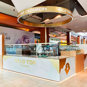
This approach can be seen clearly in the company’s first location, in an indoor mall in Topanga.
The store features several design elements familiar to fans of the brand, including a dripping ice cream design on the side of the kiosk and a halo sign overhead designed to look like the lid of one of their pints.
“This is in the middle of a mall, so there’s so much visual stimulation. We wanted to draw attention to that kiosk. The halo was one of the first design elements we built everything else around,” says Young.
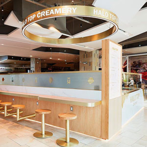 To embrace its ice cream shop roots, Halo top wanted to have seating as part of this kiosk. Developer rules, though made this challenging, noted Young. “The mall would not allow us to have those chairs on the mall floor itself, so we had to get creative. That’s why we integrated the stools into the kiosk itself.” The two stools that are on the floor, she added, were put there to meet ADA requirements.
The Halo Top location at The Grove in Los Angeles is another kiosk location, though this one is outdoors. According to Young, this is one of six identical kiosks at that mall, so making this one stand out from the rest became a primary goal of the design. “We really had to push the envelop with the developer on how we could make this different. They were pretty receptive,” Young says.
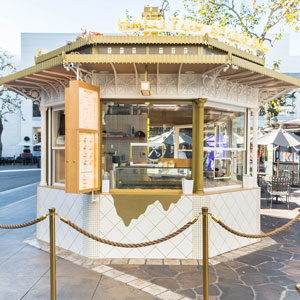
This Halo Top location achieved its distinctive look in part through its color scheme. While other kiosks are dark green, this store is designed with white and gold.
There are a number of other on-brand design elements at this location, as well, including a neon sign proclaiming it a “guilt-free zone,” a museum-like display of pints behind glass and a Halo Top logo on top that rotates.
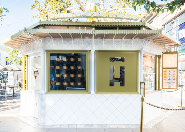
In addition to these brand-focused touches, there are several design elements that help make the kiosk more functional as an operation.
“One of the big challenges in working with such a small space was making sure everybody was being directed in a way where they didn’t feel like they were being directed and were still enjoying the experience,” says Young.
The design elements, she says, include strategically placed menu boards to help guests decide on their order before hitting the POS station, as well as signs for the order and pickup windows and gold stations to help guide traffic.
The Halo Top location in Century City, Calif., is an actual storefront and is inspired by the brand’s mint chocolate chip flavor.
Measuring just 900 square feet, the interior features a drip inspired ceiling element, as well as the phrase, “I’m cold, let’s spoon” spelled out in tile flooring.

Another key design feature is the pegboard wall, where spoons are hung in a Halo Top “H” design, which is proving to be a popular spot for Instagram moments, Young says. The pegboard has a functional purpose, as well, with the chain using it to hang signs for rotating ice cream flavors.