This better-burger chain has introduced a new prototype to emphasize food quality and its 21 burger recipes.
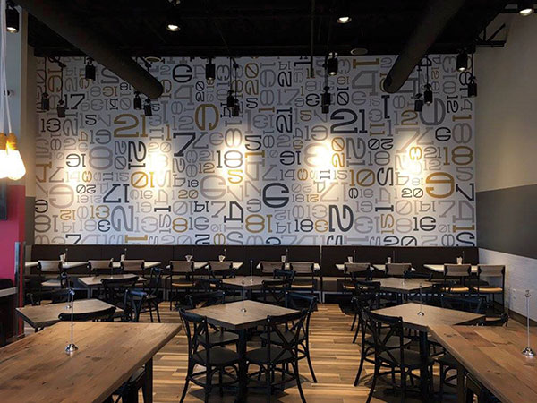 Burger 21’s number wall emphasizes the variety of the chain’s menu.
Photos courtesy of Burger 21It can take some time for a restaurant to really find its identity or at least find a way to effectively communicate that identity to its customers.
Two years ago, the leadership of Tampa, Fla.-based Burger 21 realized their company was facing that predicament, says Co-Founder and Vice President of Concept Development Arlene Johnston. Founded in 2010, the chain stands out among better-burger concepts for the breadth of its menu, she says. The 21 in the concept’s name refers to the 21 different types of burgers it offers — choices that include ground beef, ground chicken, shrimp, turkey, ahi tuna, and two types of veggie patties — alongside salads, chicken tenders and handcrafted shakes.
The company also “went all the way on quality,” says Mark Johnston, Burger 21’s president (and Arlene’s husband). The kitchen is largely a scratch operation. Its beef is never frozen and is seasoned and formed into patties in each of its 22 stores. Each store also grinds the proteins for both its chicken and shrimp burgers. Veggies like lettuce, onions and tomato are cut in house, while the ice cream used in Burger 21’s shake bar is a custom recipe with a high butterfat content.
While the Burger 21 team believes it offers a superior product, all this quality and variety was not being communicated well to customers. Few guests knew what the 21 represented or understood how much effort the chain put into making a meal. As a result, the restaurant’s perceived value scores were lower than leadership felt they should be.
This led directly to the decision to develop a new prototype that better communicated the brand’s most important elements, says Arlene Johnston. “We have high-quality ingredients and handcrafted food. That was not there [in the legacy design.]”
Show Some Personality
 Burger 21’s shake bar, on the left, has upgraded fixtures and finishes and a hexagonal tile floor for wayfinding.The company hired Terrain Collective (then known as Brand Architecture) to help not only revamp Burger 21’s looks but also to get to the heart of the brand. This included a “brand dig,” in which the employees were asked a series of questions about the company, ranging from direct to more abstract — e.g., “If Burger 21 was a song, what song would it be?”
This was followed by a series of meetings in which Terrain Collective honed the company’s brand and key differentiators, eventually getting to the brand’s essential elements: the quality and variety of its food. Once those were set, the task became driving those aspects of the company home.
Burger 21’s quality and variety are showcased through its new interior design. These are addressed most directly through the chain’s art package and wallpaper. The restaurant has three different types of wallpaper. Depending on the size of the store, one to three are used in a single store.
The first is the “quality statement” wallpaper, which puts Burger 21’s food quality front and center with a series of fun, catchy phrases, such as “BEST BUNS in the business with our exclusive brioche bun recipe,” “We’re thick, grab a spoon” and “Be the SAUCE BOSS with house-made B21 sauces.”
The second type of wallpaper is a collage of numbers up to 21 in different colors and fonts, emphasizing the restaurant’s food variety. The third consists of food photography with close-up shots of different menu items and specific ingredients highlighted by emphasizing their colors. Food quality is driven home further through posters that showcase the burgers and shakes and label each ingredient.
In addition to reinforcing messages about its food, Burger 21’s new design also provides guests with an elevated customer experience, says Mark Johnston. This is achieved through higher-quality finishes throughout the restaurant.
In legacy Burger 21 stores, for instance, the chain used “hospital-like” white ceiling tiles at about 10 feet high. In the new design, tile was replaced with an open ceiling that can be painted black, gray or off-white. The height makes the restaurants feel bigger, while all three color options add warmth to the restaurant. Financially, this change was essentially a wash, Mark Johnston notes, with the money saved on the tiles now going toward nicer-looking ductwork.
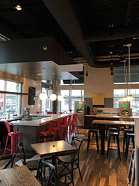
 The chain’s new logo splits the word “burger” into two stacked syllables, while the 21 is elevated to highlight its 21 burger offerings.The ceiling wasn’t the only upgraded finish. The chain replaced its light gray tile with wood-look porcelain tile. Burger 21 has also gotten creative with flooring to help direct traffic. At the restaurant’s entrance, ordering counter and the shake bar (which is exactly what it sounds like), Burger 21 has installed a hexagonal tile pattern in black, gray and tan. This tile helps direct customers to the ordering counter and then on to the shake bar, where they may be inspired to order dessert.
The shake bar itself has gotten a major overhaul. The bar’s lighting now includes pendants as well as track lights that are used to spotlight some of the ingredients used in the restaurant’s shakes. The countertop, along with the counter at the POS station, has been upgraded from Formica to quartz.
The Formica-to-quartz upgrade was also implemented in some of the restaurant’s tables. Other tables include butcher-block and distressed multi-wood tops. Burger 21’s seating now includes benches, banquettes, upholstered booths and barstools in three colors. This variety, says Mark Johnston, “makes it warmer and more interesting. It breaks up the sea of sameness.”
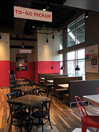
As hoped, these upgraded finishes and furnishings have improved customers’ opinion of the restaurant. “While our scores are extremely high on food quality, we wanted to bring up our perceived value number. We have done that by making the design more of a very nice casual-dining restaurant rather than that of a fast-food or fast-casual restaurant,” says Mark Johnston.
Notably, though, Burger 21 isn’t dedicated to exclusively offering a casual-dining-quality experience. At the same time this new prototype was developed, the chain had a prototype for airport locations (as well as food courts and college campuses) in the works as well. This style of store stays on-brand by reworking several design elements from the full-sized unit. The hexagonal tile used for wayfinding in the full-sized stores, for example, is part of the front-facing section of the POS counter, while the collage of numbers has been turned into one of the side walls of the unit. Menu items and ingredients are represented in small pieces of art hung on the back wall.
A Hybrid Store
 The chain specified warmer colors and higher-quality finishes in order to create a space that feels more casual than fast casual.While the first airport location with the design is not yet built, the first full-sized store built with the new design officially opened last August in Sterling, Va. That restaurant, owned by a franchisee, is actually a hybrid of the old and new designs. Many of the drawings and plans for this space were already completed when the company introduced the new prototype. Scrapping all those and starting fresh didn’t make sense from a financial or timeline perspective, says Mark Johnston.
The white ceiling tile, for instance, was installed in this restaurant since much of the design and engineering had been predicated on its use.
Despite a few holdover elements, the restaurant’s design still had to be changed dramatically — and in short order.
Much of the legwork for this task fell to Simone Sanguinette, Burger 21’s construction and design manager. Given the tight timeline for this project — the restaurant was actually under construction before everything was specified — Sanguinette made the situation clear to the representatives of the factories she worked with.
“I just stressed that we needed to get everything decided right now and we needed prices right now,” Sanguinette says. “I explained that we did a brand refresh, we had a new Burger 21 and all the materials we selected were going to be in every Burger 21 from now on — not only the new restaurants but also the corporate and franchised stores, which were going to be remodeled.” She was able to spec out the store in good time.
Not every decision was made at once, of course. Understandably, one of the big challenges of this project was getting Burger 21’s leadership to sign off on dozens (if not hundreds) of decisions large and small, then making sure all those decisions were effectively communicated to the general contractor. Sanguinette also had to know the lead times for the preferred materials. After all, a good material at a good price isn’t worth much if it’s not there when the contractor needs it.
Despite the potential for chaos, there were only a few hiccups during construction. The quartz for the countertops and tables was out of stock in the United States and had to be imported by the factory. Not many other aspects of the build depended on countertop installation, though, so this didn’t prove to be too much of a headache, Sanguinette says.
Dealing with the hiccups and communicating final design decisions, Sanguinette added, was made easier by the project’s general contractor. The chain had worked with this particular firm several times in the past, and their partnership made it easier to communicate and solve problems on the fly.
Sanguinette’s attention is now on prepping for remodels of existing restaurants. While there’s no firm timeline for when this phase of the project will be complete, the first corporate remodel began at the end of February.
These projects, Sanguinette says, are being planned with a tight budget in mind. Instead of ripping everything out and replacing it with the new materials, the chain is going to focus on design elements that are easy to change or are central to Burger 21’s new look. Elements that are durable, close enough to the new look and expensive will likely remain.
The old gray tile flooring, for example, will stay, but the chain will add in the new hexagonal tile in key spots. The millwork will remain, but the countertops will be swapped out. And, of course, the paint, wallpaper and artwork will all be replaced with the new design elements.
Overall, this will result in a Burger 21 that, while slightly different from the new prototype, will effectively drive home the concept’s key elements: a menu that features a wide variety of high-quality food served in a warm, welcoming environment.
The performance of the earliest stores with the new design shows these ideas are coming through, says Mark Johnston. “The overall feeling I got after seeing [the new store in Kenesaw]: I was very, very pleased with the level of finishes and general look of the restaurant,” he says. “You don’t expect to see a restaurant that nice in the fast-casual realm. There was a really strong impact on the perceived value to the guest. It was functioning well, working well, and it was busy.” +
Snapshot
- Headquarters: Tampa, Fla.
- Concept owners: Mark and Arlene Johnston
- Concept: Better-burger concept with an emphasis on menu variety
- Segment: Fast casual
- Average check: $11
- Total unit count: 22
- Size: 2,400–3,500 square feet
- Real estate: Retail center endcaps, freestanding
- Design highlights: The interior has been redesigned to create a more inviting space where guests would want to dine in. The chain has changed up the color, lighting and materials to create accent walls. Each of these pieces communicates the brand’s commitment to quality food and a broad menu.
Project Team
- Project lead: Simone Sanguinette, Burger 21 construction and
design manager - Architect: David Hiatt, Hiatt Architecture
- Kitchen supplier: Johnson-Lancaster
- Interior design: Burger 21 Intl.
- Kitchen design: Johnson-Lancaster and Associates